1. Warm White KALLAX with Walnut Veneer Inserts
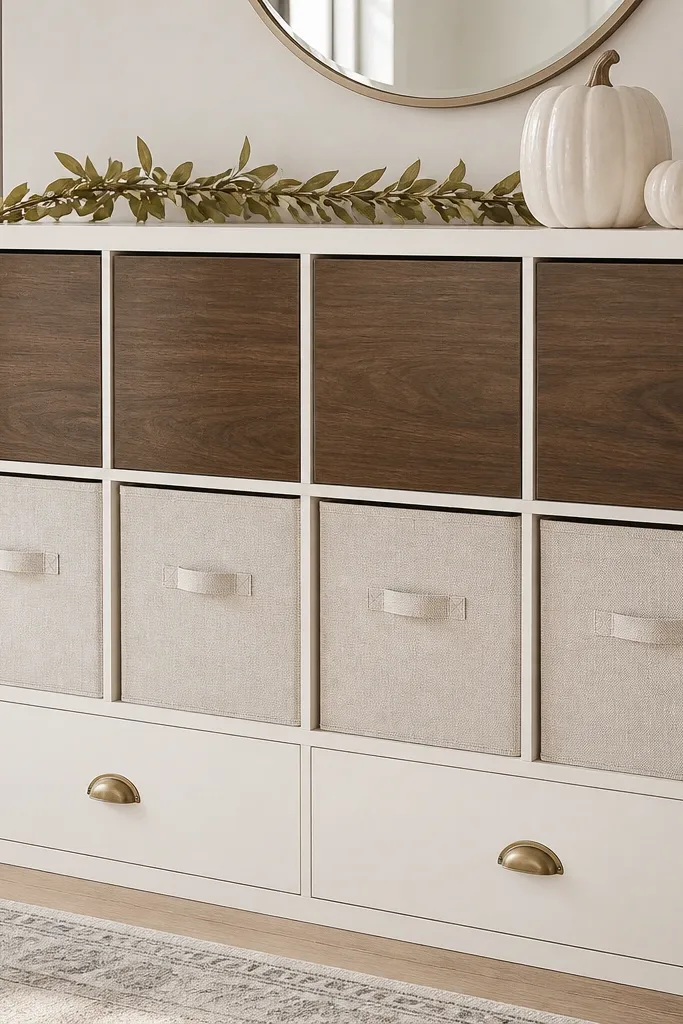
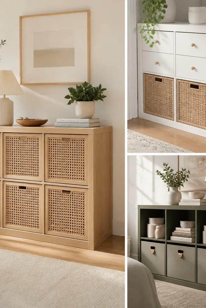
This makeover makes KALLAX look like a built-in because the veneer inserts break up the flat grid. Warm white paint softens the IKEA gray cast, and walnut-look veneer adds the wood warmth your seasonal decor needs. Linen baskets keep the bays from looking like storage bins. The brass pulls add a small metallic highlight that reads “intentional” even when you don’t decorate heavily.
Paint the frame with a cabinet-grade water-based paint in warm white. Cut veneer panels to fit the bay depth and use a smoothing tool to press edges flat. Swap any generic pulls for brass cup pulls; keep the rest of the hardware the same if you want a faster build. For a seasonal top, use a 6-foot string garland cut to 3-4 feet and tuck it behind a small tray.
Quick tipUse a scrap of cardboard as a spacing gauge so veneer edges line up at the same height across every bay.
One warningSkipping primer on glossy IKEA surfaces makes the paint look patchy within a month.
2. BESTÅ Console Look with Painted Door Fronts and Black Trim
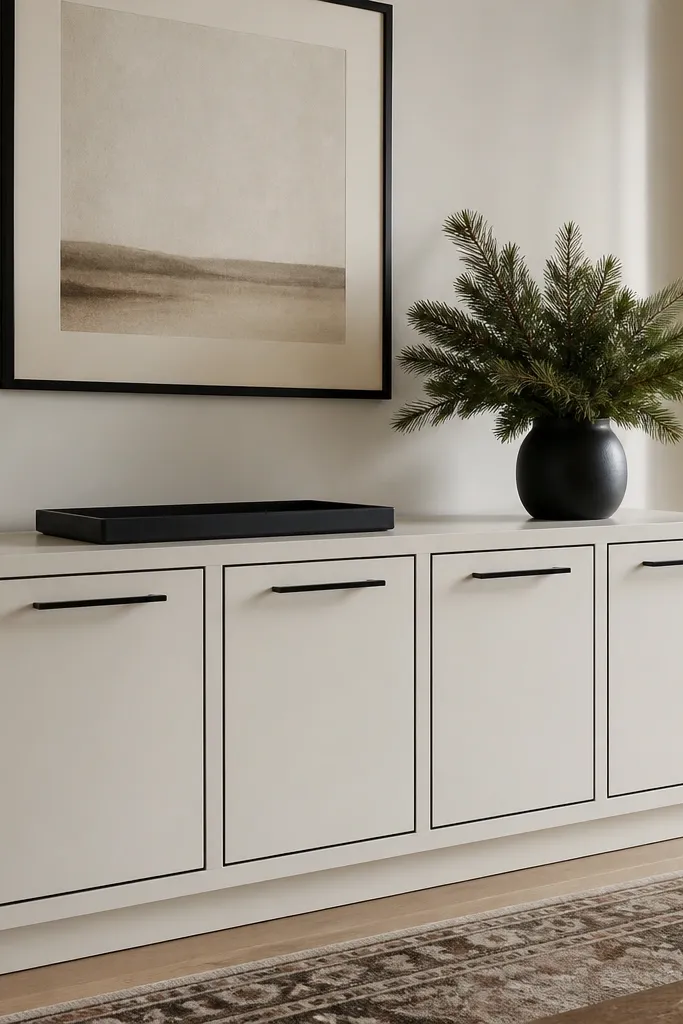
The trick here is turning plain door slabs into frames. The black trim creates a picture-frame effect, which makes the unit feel custom without replacing anything major. Matte off-white keeps it airy, and black hardware makes seasonal greens and golds look sharper. This style works when you want holiday decor to look tidy instead of like it spilled out of bins.
Tape a 3-5 mm border around each door edge, then paint the border with matte black. Use a foam brush for the taped lines and remove tape while paint is still slightly tacky. Replace bar pulls with matching black bar pulls sized to your door width so they don’t look too small. Add a shelf runner in black faux leather or felt so the inside looks finished.
Quick tipIf your doors have a glossy sheen, scuff-sand with 180 grit and wipe with a tack cloth before painting.
One warningUsing glossy black paint on a matte base makes the piece look like separate parts.
3. BILLY Bookcase with Fabric Lined Back Panels
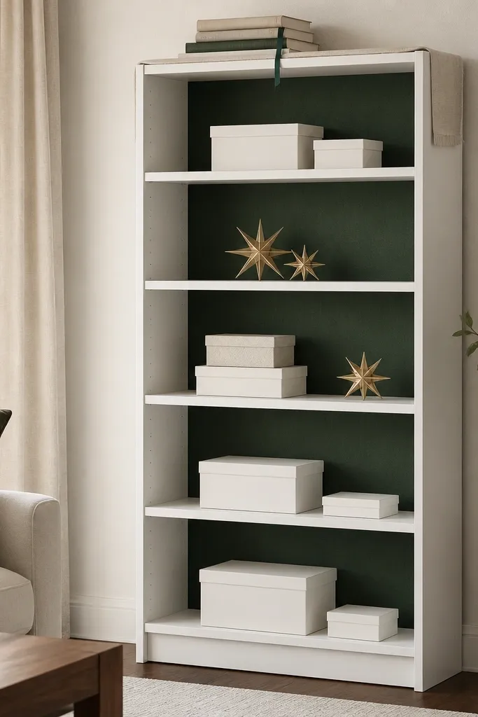
Fabric backs add instant warmth and depth, especially for winter styling. The green creates a believable “holiday backdrop” so ornaments look more cohesive. It also hides small gaps and makes shelves feel like rooms inside a room. I like linen-cotton blends because they don’t shine like satin and they photograph well.
Remove the original back panel if you can access it, or cover the back with a fitted fabric panel cut to the outer dimensions. Use spray adhesive or a staple gun with thin staples along the frame edges. Add a light wood stain to any visible edge strips if you want contrast. For shelf decor, keep boxes in white, cream, and one metallic (gold or brass).
Use a ruler and mark fabric cut lines with a fabric chalk so your panel stays square.
Letting fabric sag between staples — it looks messy instead of tailored.
4. TROFAST Storage with Painted Fronts and Removable Shelf Paper
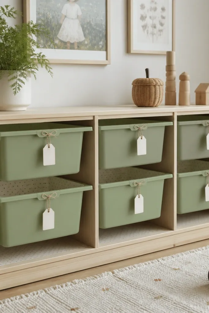
This style keeps storage looking designed while still being practical. The sage green reads “seasonal” without screaming Christmas, and the removable shelf paper makes it easy to switch themes for fall, winter, and spring. Labels make it look intentional even when the bins aren’t fully styled. The key is clean edges and consistent paper alignment.
Paint the bin fronts with a durable paint — I used a water-based enamel style product for smooth coverage. After drying, line the bin interiors with contact paper cut slightly oversized and trimmed with a craft knife. Use a hole punch to add label ties so tags don’t peel off. Keep bin colors to two tones max so it doesn’t look like a craft store aisle.
Press paper edges with a plastic card so corners don’t lift when you slide bins in and out.
Cutting paper too small so it wrinkles — it shows every time the bin moves.
5. LACK Wall Shelves Stacked Like a Gallery for Holiday Vignettes
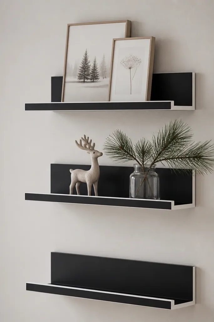
Stacked wall shelves make holiday styling feel curated instead of spread across the whole room. Matte black gives you a strong contrast background for ornaments and greenery. The white trim makes the shelves look more architectural. This is my go-to when I want seasonal decor without taking over floor space.
Sand LACK lightly, prime, then paint matte black with a mini roller for even coverage. Add a thin white border using tape and a brush, or apply a narrow self-adhesive vinyl strip. Mount using the manufacturer bracket positions and use a level — crooked shelves ruin the gallery look. Build vignettes by grouping items in clusters of 3: one taller, one medium, one small.
Quick tipPlan your ornaments first on the floor, then transfer positions to the wall with painter’s tape marks.
One warningHanging shelves without checking level at the far end — it shows instantly.
6. KALLAX Half-Height with Painted Back Board and Peg Rail
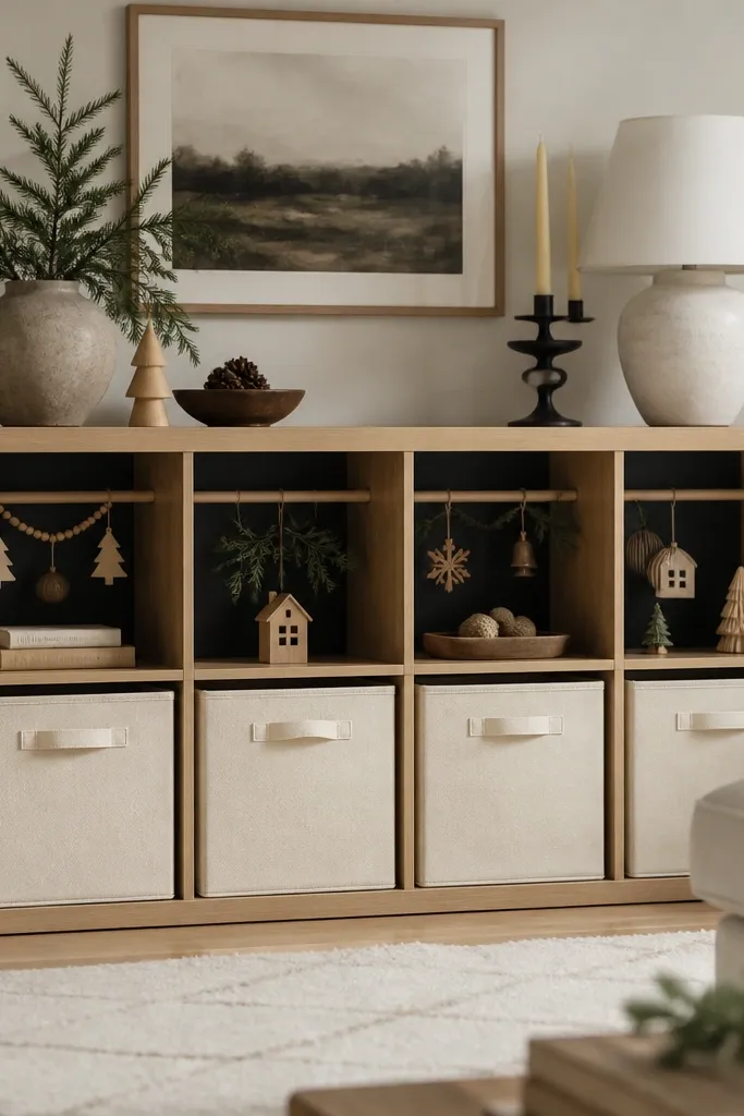
A painted back board turns empty space into a design element. Charcoal makes gold ornaments and red ribbon look richer, and it hides clutter when you’re mid-season. The peg rail gives you a place to hang garlands and wreath pieces so they don’t end up in a box. It’s a stylish storage system that’s also functional year-round.
Paint the back panel with a durable matte charcoal paint. Add a peg rail cut to fit the inside width and screw it into the back frame where you have solid material. Use small hooks and clip garlands with clothespins so they hang flat. Keep baskets in cream or natural fiber so the charcoal stays the main visual.
Quick tipTest hook positions with your actual garland before mounting the rail so you don’t end up with slack loops.
One warningUsing shiny paint on the back — reflections make small ornaments look messy.
7. HEMNES Sideboard Style with Distressed Edges and New Hardware
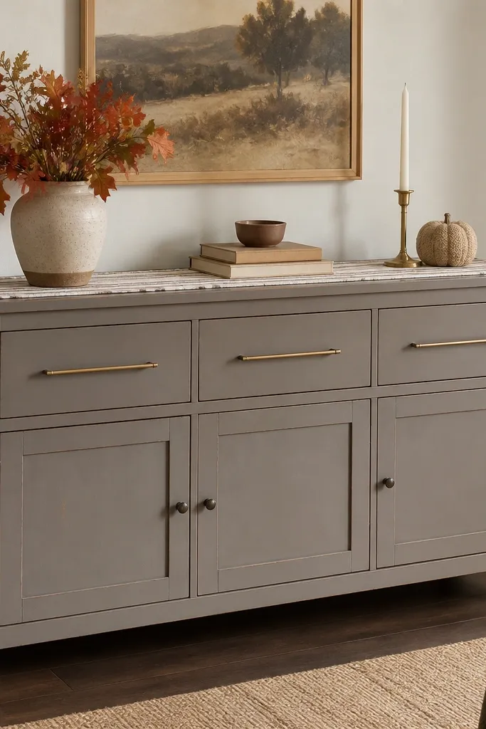
Distressing on edges makes IKEA furniture look like it has history, but you need restraint. I’ve done this with warm gray and a lighter underlying color so the wear looks natural. Brass pulls add a warm metal tone that pairs with autumn and holiday greens. The result looks styled even with simple decor on top.
Paint the piece in warm gray and let it cure fully, then sand only the corners and drawer edges with 220 grit. If you want controlled distress, rub a small candle wax on edges before the final paint so you can wipe off paint later. Swap to long brass pulls sized to your drawer width. Add a felt pad under decor so the top doesn’t scratch.
Quick tipUse a rag to blend distress — sharp sand lines look like damage, not design.
One warningOver-distressing the flat front panels — it makes the whole piece look worn out.
8. RIBBA Frames as Faux Cabinet Doors on a Small IKEA Cabinet
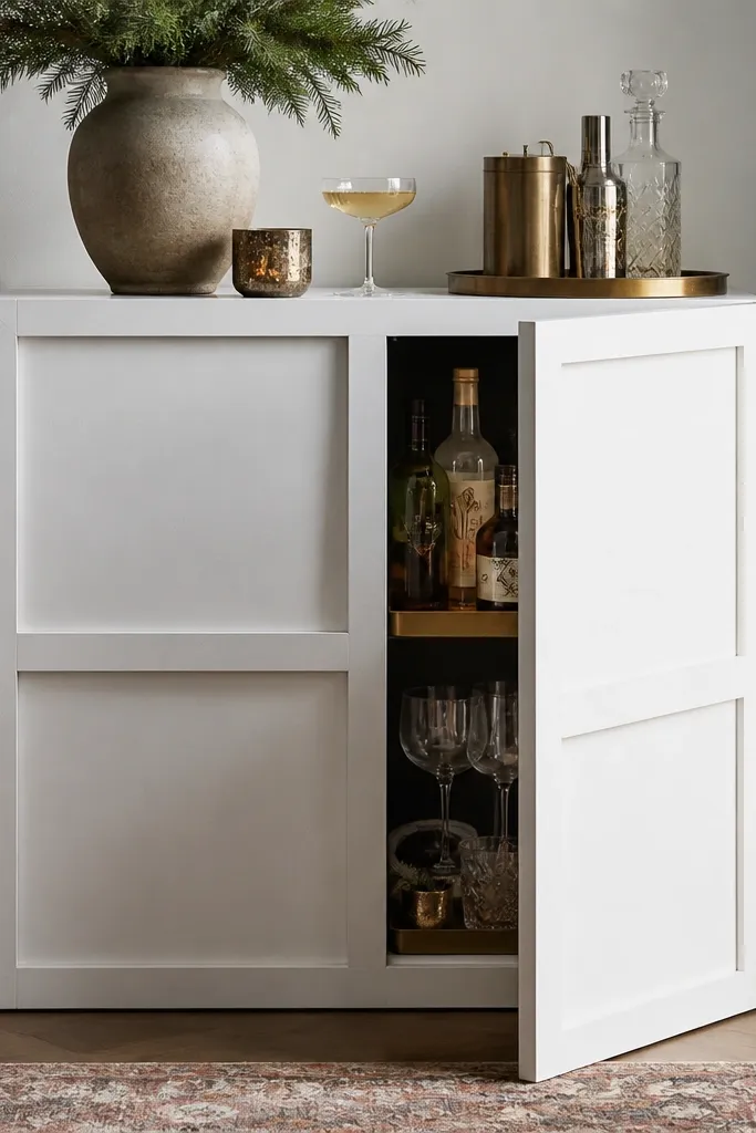
This gives you a cabinet-door look without buying custom doors. The frame grid breaks up the flat front and makes the piece feel designed for display. Matte white keeps it crisp for winter styling, and the frame lines make it easy to theme with colored glass and ribbon. It’s a great option when your piece is plain but solid.
Build a front overlay by mounting frame strips to a plywood or thin panel cut to fit the cabinet opening. Paint the panel matte white, then glue or screw frames into a neat grid. Use small knobs or keep existing pulls and just add the frame overlay. Inside, place a simple tray so your holiday items look grouped.
Quick tipDry-fit every frame row before painting so you can adjust spacing without repainting.
One warningRushing glue placement — misaligned frames look crooked even from across the room.
9. KALLAX with Sliding Fabric Curtains Instead of Bins
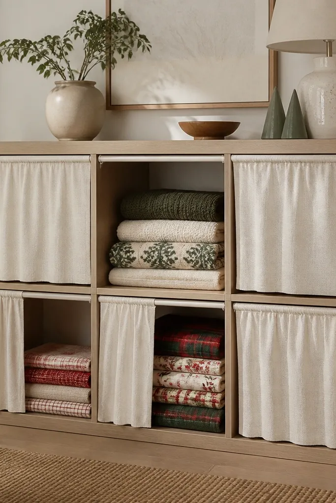
Curtains hide the messy parts of storage while keeping the unit soft and seasonal. Cream fabric makes the room feel warmer, and the texture looks better than plastic bin fronts. This setup also lets you swap holiday linens without reorganizing everything. For winter, I like keeping plaid or subtle snowflake patterns only in one or two bays.
Attach a track or use curtain rod brackets inside the bay openings, then sew or hem curtain panels to cover each bay width. Use iron-on hem tape if you don’t want to sew. Choose fabric weight that hangs straight — medium cotton-linen blends work well. Add a small tieback in matching fabric for when you want the bays open.
Quick tipUse double-sided tape at the top hem while you mark the track holes so the curtain hangs evenly.
One warningUsing very thin fabric that clings — it looks cheap and shows everything behind it.
10. BESTÅ Door Swap with Glass Look Film and Black Frame Paint
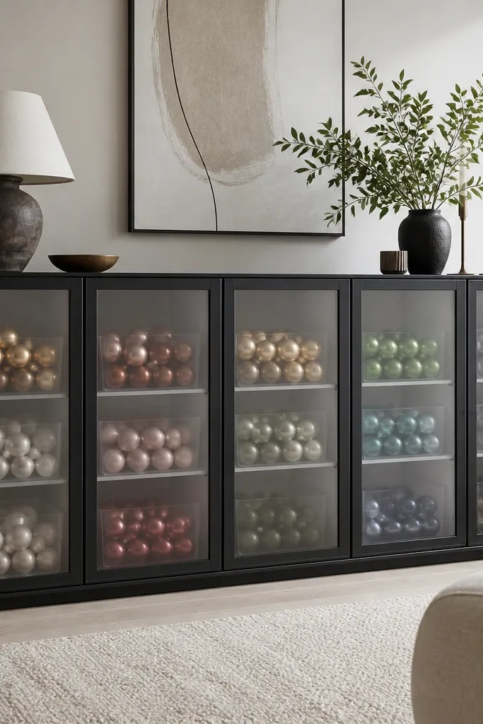
Frosted glass-look film turns your storage into a display cabinet. Black framing makes ornaments pop, and the frosted finish hides clutter so it stays stylish even when you’re not decorating. This is one of the quickest ways to make a winter setup feel intentional. It also works for fall with neutral ceramics and wood beads.
Paint the door frames black, then apply glass-look film to the door inserts. Use a spray bottle with soapy water to position film, then squeegee out bubbles with a microfiber cloth. Trim edges with a sharp blade and wrap any raw edges with thin black vinyl strip if needed. Inside, use matching clear boxes so the display stays tidy.
Quick tipLabel the doors and film sheets before you start so you don’t mix up inserts and end up with miscuts.
One warningApplying film dry — it traps dust and creates permanent specks.
11. IKEA Side Table with Stenciled Snowflake Top in Two Whites
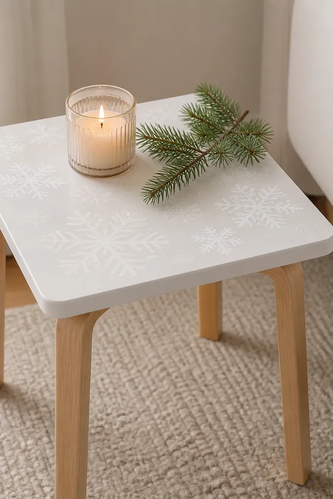
A stencil top gives you a holiday focal point without changing the whole room palette. Using two whites keeps it subtle — the pattern reads in daylight and looks crisp at night with candle glow. Leaving the legs wood keeps it grounded so it doesn’t look like a disposable decoration. I like this for small spaces where you can’t fit a whole cabinet makeover.
Paint the table top with a warm white, let it cure, then stencil with a second white using a foam stencil brush. Mask off the edges so you don’t get paint bleed. Seal the top with a clear protective coat that dries matte. Add a tray to contain candles so wax spills don’t stain the pattern.
Tape the stencil with low-tack painter tape and re-align between prints so the snowflakes don’t creep.
Using thick paint for stenciling — it clogs the design and looks fuzzy.
12. KALLAX Shelf Liner Upgrade with Marble Contact Paper and Gold Tape
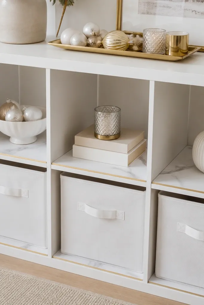
Marble-look liners make KALLAX feel like a boutique display shelf. The gold tape border frames the liner so it looks intentional instead of like you put paper in it. It’s perfect for winter because silver, gold, and white ornaments already look “designed” against marble. The best part is you can swap the decor quickly without changing the furniture.
Cut marble contact paper to the shelf dimensions and allow a small overhang, then trim with a blade. Apply gold tape along the front edge where the liner meets the shelf lip. Smooth with a plastic scraper to avoid bubbles. For color balance, keep storage bins in white, cream, or light gray so the marble doesn’t fight them.
Quick tipUse a craft knife on a metal ruler — it cuts clean lines through contact paper.
One warningLeaving bubbles — they show as shiny spots under room light.
13. IKEA TV Bench Makeover with Faux Leather Drawer Fronts
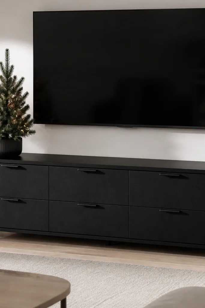
Faux leather drawer fronts make even a basic bench look polished. The black surface hides scuffs better than shiny paint, and it pairs well with warm string lights. When you style the top with evergreen and warm white LEDs, the whole piece looks like a real media console. This also helps when you have kids because wipe-clean matters.
Cut faux leather wrap panels slightly larger than the drawer fronts, then adhere with contact cement or strong double-sided adhesive. Wrap the edges tightly and press them down with a roller. Replace pulls with matte black hardware for a consistent look. Add a fabric cable sleeve under the bench so cords don’t show.
Quick tipRound the corners slightly before sticking so the wrap doesn’t crease at sharp edges.
One warningUsing fabric glue — it loosens and peels at corners.
14. SKUBB Hanging Organizer Turns Into a Doorway Holiday Display
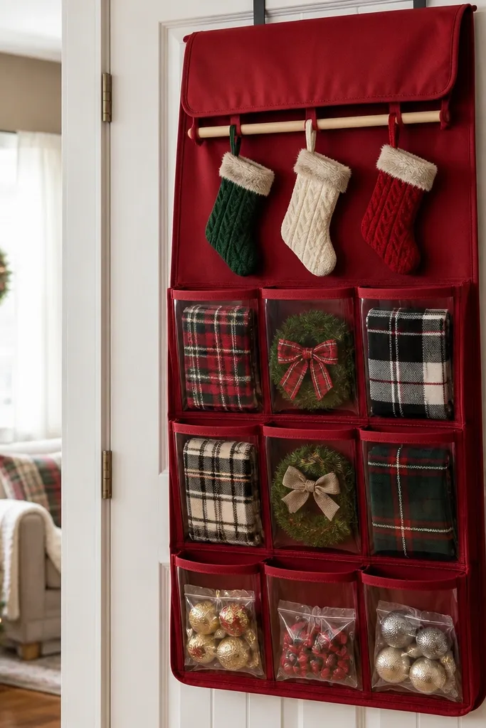
This is the “I need holiday storage that looks good” option. A hanging organizer turns small seasonal items into a front-facing display instead of a hidden box. Deep red fabric reads holiday immediately, and the pocket layout keeps things from looking messy. It also works for non-holiday seasons if you switch to neutral covers.
Mount the organizer so it sits flat and doesn’t sag — use the provided hooks or sturdy command strips if your door surface allows. Make a removable fabric cover by sewing elastic at the top edge or using Velcro strips so you can take it off and wash it. Fill pockets with small clear bags for ornaments and ribbon bundles so they don’t spill visually. Add a mini dowel with two hooks at the top for stockings or ribbon spools.
Use small binder clips to attach ribbon ends so they don’t unravel in the pockets.
Overstuffing pockets — it makes everything look wrinkled and cheap.
15. IKEA Bench with Ribbed Panel Front and Evergreen Green Paint
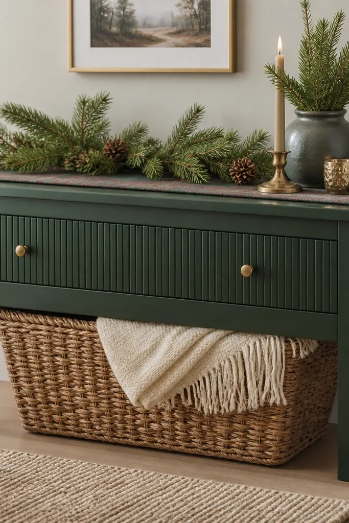
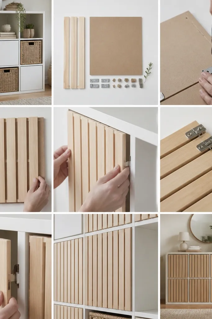
Ribbing gives you texture without adding clutter. Evergreen green makes holiday decor look richer, especially gold and cream accents. The centered brass knobs create an anchor point so the bench looks intentional even when the top is simple. This works well in entryways where you want a seasonal refresh that doesn’t look like a temporary stand.
Paint the entire bench in evergreen green using a satin finish so it catches light softly. Add a ribbed front panel by mounting thin vertical slats or using a ribbed panel insert cut to size. Sand edges smooth so the ribbing doesn’t feel sharp. Use matching brass knobs and keep the runner on top to one pattern only.
Quick tipPaint the slats separately and then attach — it prevents uneven coverage in the grooves.
One warningLeaving rough edges on ribbing — it collects dust and looks unfinished.