1. Matte Black Welcome Sign With Backlit Look
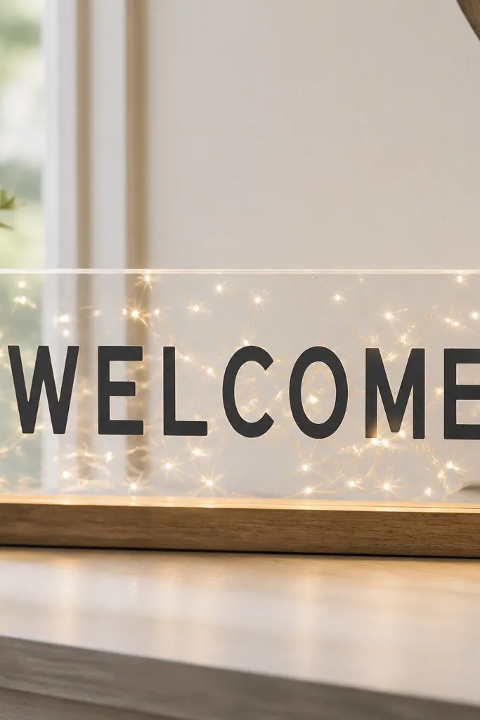
This one looks expensive because the vinyl stays matte while the background glows. I use matte black vinyl on clear acrylic so the letters read clean in daylight and in evening shots. The glow comes from lights behind the acrylic, not from glossy vinyl, so it still looks modern.
Cut your letters in matte black vinyl using a bold sans font at 3-4 inch letter height depending on your sign size. Mount the acrylic on a foam board and place warm white LED string lights behind it, then apply vinyl to the acrylic’s front. Keep a 1/2 inch margin around the text so the edges never look crowded.
Weed carefully and press with a brayer so the vinyl edges stay sharp, especially on curves like O and C.
Avoid glossy vinyl — it reflects glare and makes the whole sign look like a sticker.
2. Modern Table Numbers on Brushed Gold Cardboard
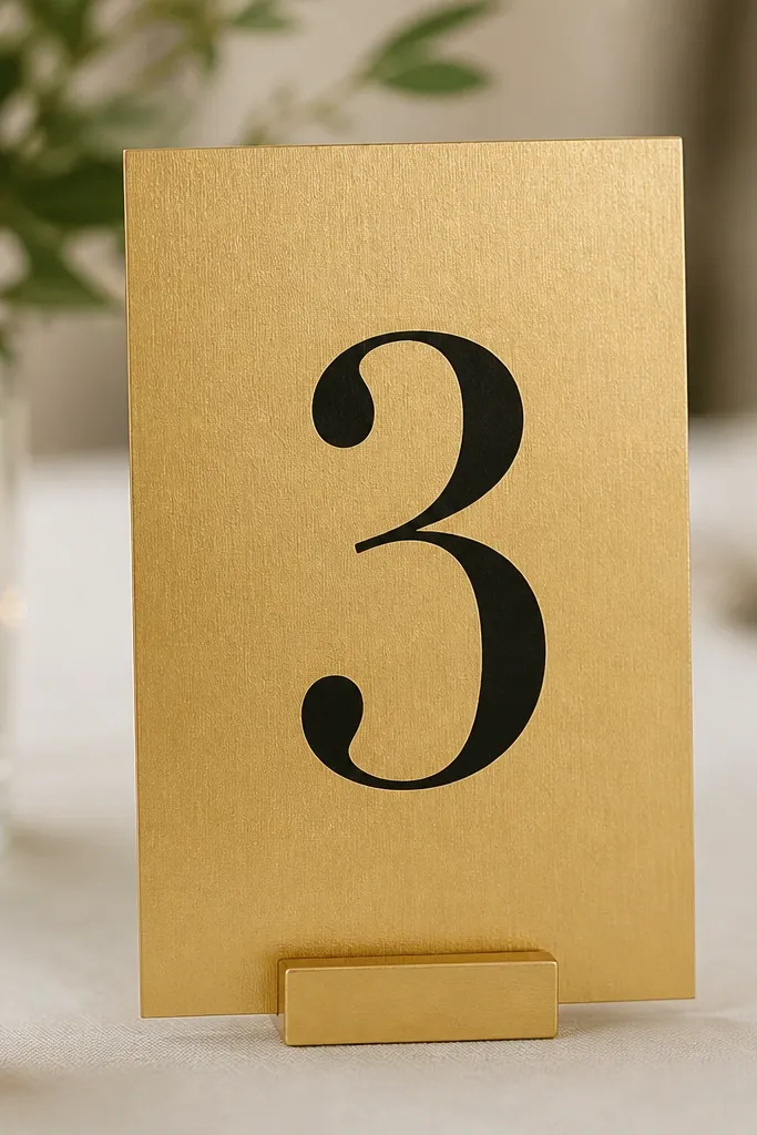
Table numbers are one of those things guests photograph even if they don’t notice the craft. Brushed gold cardstock gives you a metallic texture without the mess of foil stamping. Matte black vinyl on top reads modern and stays readable from across the table.
Cut numbers from matte black vinyl at about 3.5-4 inches tall. Use brushed gold cardstock for the base and mount each number panel on a small acrylic or wood stand. Leave at least 1 inch of gold border around the number so the texture frames it.
Use a font with consistent stroke width like a geometric sans so the numbers look crisp, not “thin and delicate.”
Don’t put tiny numbers on tiny cards — they disappear in group photos.
3. Menu Board Vinyl for Your Bar Station
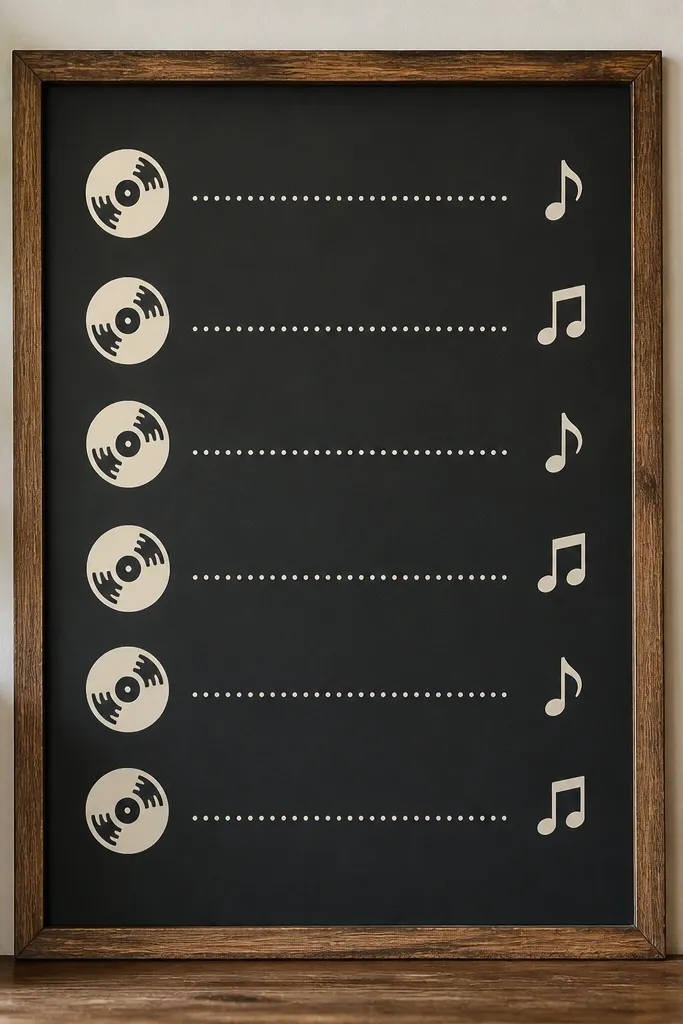
Vinyl menus look clean because you can align everything with Cricut’s text tools. I like using a mix of all-caps headings and smaller body lines so it reads like a printed menu, not a craft label. The key is spacing — menus look modern when lines breathe.
Choose a matte surface board (chalkboard paint on wood or a matte acrylic sheet). Cut vinyl for headings in 2.5-3 inch height for “COCKTAILS” and 1-1.5 inch for drink names. Add small icons (like a martini glass) cut from the same vinyl color, then apply with transfer tape for smooth placement.
Measure your board and lock your layout before cutting by taping the vinyl test strip in place.
Avoid overlapping transfer tape on top of existing vinyl — it creates bubbles and misalignment.
4. Personalized Place Cards in a Two-Color Frame
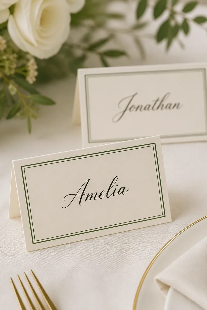
This is my go-to for modern place settings because it looks finished even when you only have one quick photo angle. The frame gives structure, and the name is the focal point. I like deep green + ivory because it reads warm and not overly trendy.
Cut a thin rectangle frame from deep green vinyl and apply it to ivory cardstock sized about 3.5 x 2.5 inches. Add names in a readable script or simple handwriting-style font, either printed or cut vinyl, placed about 1/3 down the card. Fold a small tent stand or use a clip-style stand.
Do a test cut on scrap and check that the vinyl weeding doesn’t break thin script lines.
Avoid frames that are too thick — they swallow the name and look heavy.
5. Acrylic Favor Tag Labels With Waterproof Ink
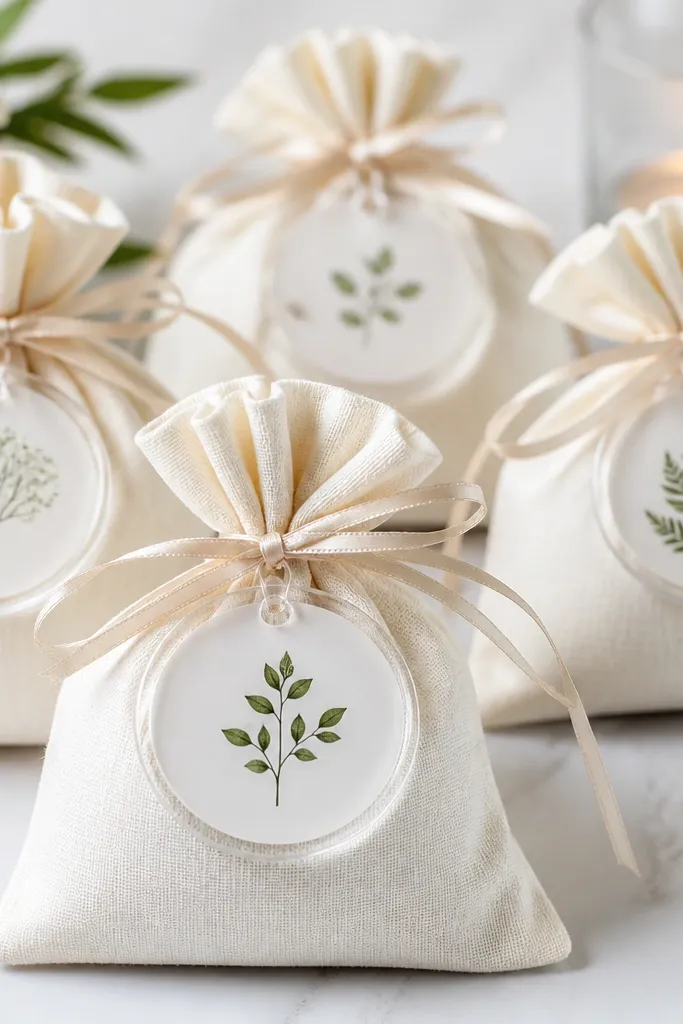
Clear acrylic tags make favors feel intentional, especially when you keep the design simple. The modern look is clean typography and a tight layout, not lots of icons. I use waterproof ink for printed components or matte vinyl for a more uniform finish.
Quick tipUse a hole punch that matches your ribbon width — tags that are too tight look warped right away.
Cut tag shapes from cardstock or use pre-punched acrylic tags. Apply vinyl text and a short line like “THANK YOU” in a small all-caps font. Tie with 1/8 inch satin ribbon in champagne or dusty rose and leave 1/2 inch tail so it hangs neatly.
One warningAvoid glossy finishes on clear tags — glare makes the text hard to read in photos.
6. Heat-Transfer Napkin Wraps With Names
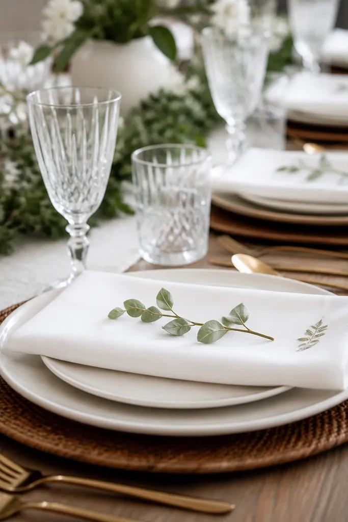
Napkin wraps make the table look coordinated without adding bulk. Heat-transfer vinyl stays put through handling, and the names make each setting feel personal. I keep the text small and centered so it looks modern instead of like costume labels.
Quick tipChoose a font with thick lowercase strokes; thin script can crack after washing.
Use a heat-transfer vinyl sheet cut for each guest name, sized about 1.5-2 inches wide. Press onto a narrow strip of cotton napkin fabric or a matching cotton band you sew beforehand. Press with firm, even pressure and hold time per your HTV brand — then cool flat.
One warningAvoid ironing through steam — it can shift the adhesive and blur the edges.
7. Geometric Seating Chart Poster With Vinyl Overlays
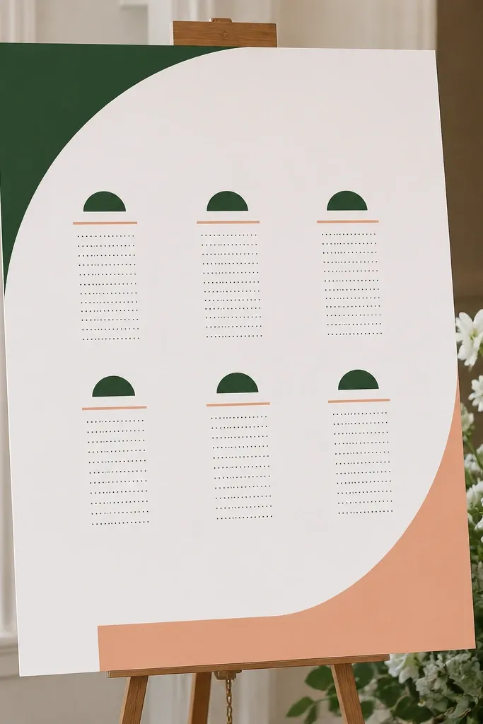
A seating chart looks modern when it’s structured like a grid, not a block of text. Vinyl lets you layer shapes and headings cleanly. I use one bold color for section headers and one neutral for labels so it reads fast for guests in motion.
Quick tipDo a pencil grid on the board first so your vinyl lines end up perfectly straight.
Start with foam board or matte poster board, about 18 x 24 inches. Cut section headings in matte vinyl (like “BRIDESMAIDS” or “TABLE 1-6”) and add simple geometric shapes like triangles or lines behind the lists. Place the guest names in smaller vinyl or printed text, leaving consistent row spacing.
One warningAvoid mixing too many font styles — it looks like a collage.
8. Table Runner Vinyl Stencils for a Subtle Monogram
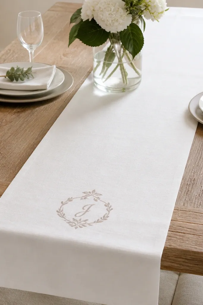
If you want modern without heavy decor, stenciling on the runner is the move. The vinyl stencil gives you sharp edges and keeps the monogram centered. I’ve used this on both linen and cotton blends, and it photographs well because it’s understated.
Quick tipTest your paint opacity on a scrap runner piece so you don’t have to do thick layers.
Cut a monogram stencil from vinyl and place it on the runner with light tack adhesive or painter’s tape. Use fabric paint and dab with a foam brush, building color in thin passes. Remove the stencil while the paint is still slightly tacky so you get cleaner edges.
One warningAvoid brushing hard — it pushes paint under the stencil edges.
9. Cricut-Cut Floral Sticker Sheets for Water Bottle Labels
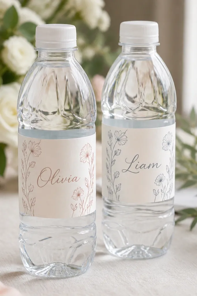
These are the fastest way to make a drink station look styled. Using sticker paper with Cricut Print then Cut (or laminated vinyl if you prefer) gives you crisp line art that doesn’t smear. Keep the floral art small and let the names do the talking.
Design labels sized to wrap around bottles with overlap of about 1/4 inch. Print on waterproof sticker paper and use Print then Cut alignment. Apply to cooled bottles so condensation doesn’t mess with adhesion.
Use a matte laminate if you expect outdoor humidity — it reduces glare in photos.
Avoid glossy labels — they reflect overhead lights and look cheap on camera.
10. Modern Candle Labels With Heat-Resistant Vinyl
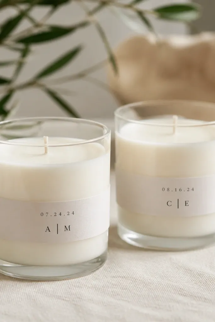
Candle labels look clean and modern because you can keep them narrow and typographic. Heat-resistant vinyl holds up better than regular craft vinyl around warm jars. I like minimalist labels with just initials and a date so the candles don’t compete with centerpieces.
Cut a vinyl band for each candle — around 1 inch tall and sized to wrap snugly. Apply to a clean, dry jar surface and burnish edges with a card. For dates, use all-caps numbers in a simple sans font and keep it centered.
Wipe jars with rubbing alcohol first so vinyl sticks without lifting corners.
Avoid placing labels over curved ridges — it causes wrinkling and bubbles.
11. Vinyl Signage for Photo Booth Props Without Clutter
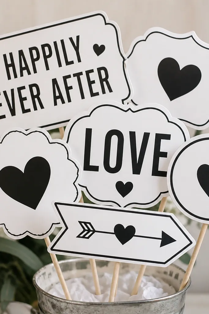
Photo booth items get handled all night, so you need durable, crisp letters. Vinyl on foam board gives you that clean look and quick assembly. Matching colors across every sign makes the photo wall look intentional.
Quick tipCut a small circle or square behind each word for contrast — it makes the design pop without adding extra graphics.
Cut words from matte vinyl and apply to foam board cut into 6 x 8 inch rectangles. Attach to wooden dowels with hot glue, centered and straight. Use the same vinyl color for all signs and vary only the text.
One warningAvoid tiny vinyl details on props — they peel when grabbed.
12. Cricut-Cut Acrylic-Style Wedding Monogram Stickers
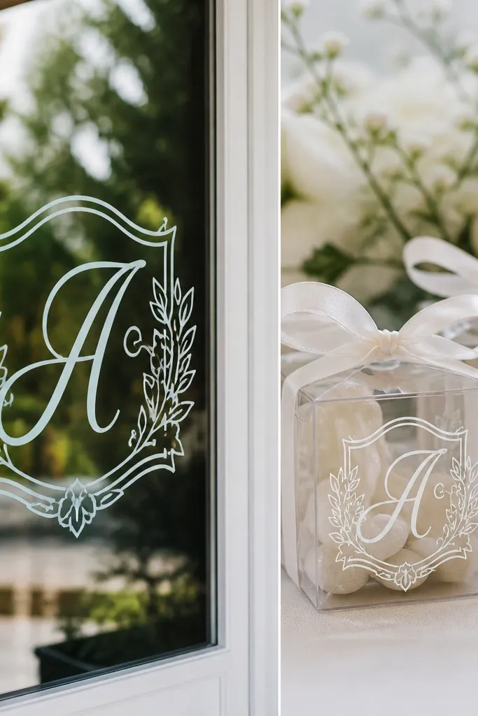
This is the easiest way to make multiple surfaces look coordinated. The trick is using an outline cut so the monogram stays readable on dark and light backgrounds. I use it on glass doors, welcome boxes, and favor packaging.
Quick tipUse a weeding tool and take your time on thin lines — monograms show every mistake.
Cut your monogram in white vinyl with a second outline layer (like a slightly larger shape in a contrasting color). Apply to clean glass or smooth kraft boxes. If you’re applying to cardboard, press harder on corners and edges.
One warningAvoid placing stickers on dusty packaging — corners lift fast.
13. Modern Wedding Program Covers With Cut-Edge Typography
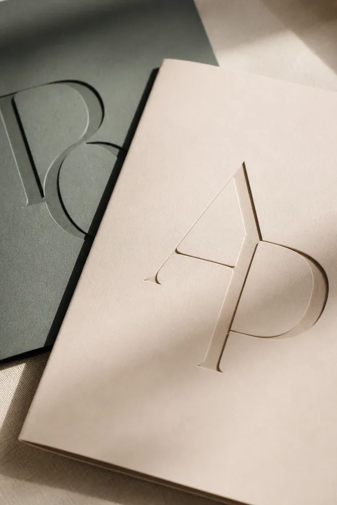
Programs look modern when the cover has one bold typographic element and lots of breathing space. Cricut lets you cut clean vinyl or cardstock letters that look like a printed design. Keep the cover heavy — thin cardstock curls and looks homemade in a bad way.
Quick tipBurnish the vinyl edges with a silicone tool to prevent lifting at the fold.
Use 80-110 lb cover cardstock for the booklet and cut the main title letters with vinyl or direct-cut cardstock vinyl-like material. Apply with transfer tape or glue stick thinly for cardstock letters. Fold the booklet and keep the title centered on the front with equal top and bottom margins.
One warningAvoid overcrowding the cover with multiple lines — it looks busy and dated.
14. Vinyl Window Cling Direction Signs for Parking and Restrooms
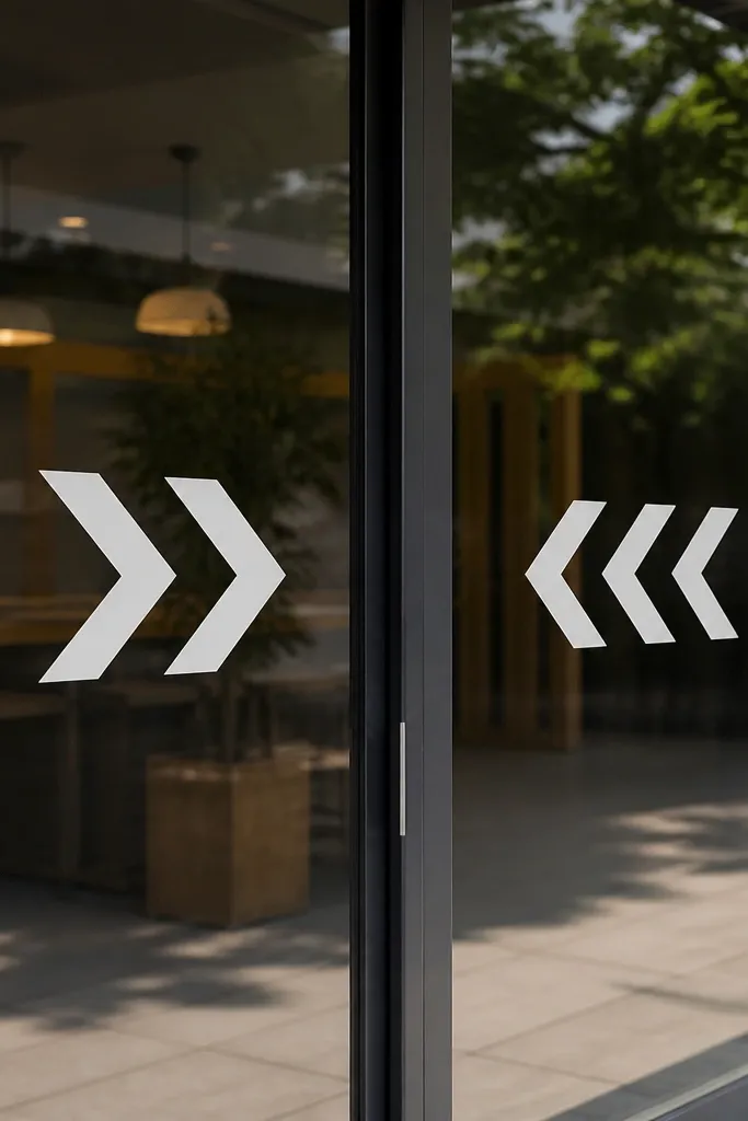
Clings are the most practical wedding signage because they move easily and don’t ruin surfaces. Cricut-cut arrows are readable from a distance, and you can keep the design consistent with your main font. I use them for parking, restrooms, and “Ceremony Location.”
Quick tipMake a small set of blank arrows too — you’ll be able to correct placement without re-cutting.
Cut arrow shapes and text in a bold font with matte vinyl cling material. Place on glass using a light mist of water with a drop of dish soap for repositioning, then squeegee out bubbles. Use 2-3 inch arrow heads and 1-1.5 inch text height for quick visibility.
One warningAvoid thin, hairline arrows — they disappear at night.
15. Centerpiece Tags for Bud Vases With Layered Vinyl Borders
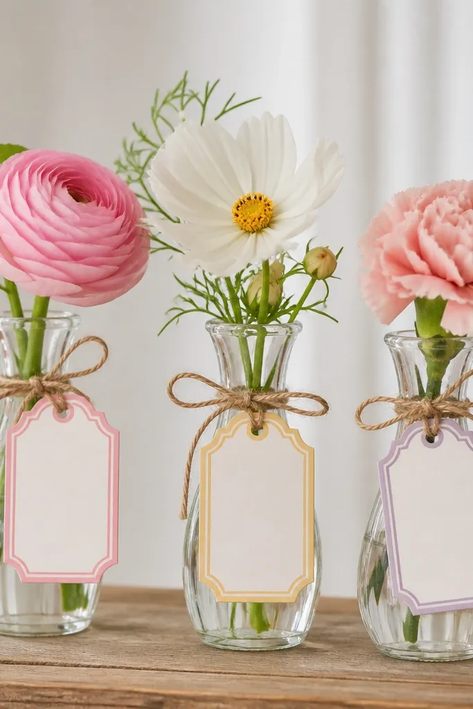
Bud vases look polished when every vase has the same tag format. Layered borders make the tag look designed even if the text is short. I keep the tag text to one word like “EUCALYPTUS” or a name so it doesn’t turn into a wall of writing.
Quick tipUse a ruler to align the border — crooked tags stand out fast in close-up photos.
Cut tags from ivory cardstock about 3 x 4 inches. Apply a layered vinyl border in two colors, then add a single line of text in matte black. Punch a hole at the top and tie with 1/8 inch twine, leaving a 2 inch tail for a neat bow.
One warningAvoid mixing twine colors — brown twine with white cardstock looks off for modern weddings.
16. Cricut Cut Place Mat Stickers for Charger Cards
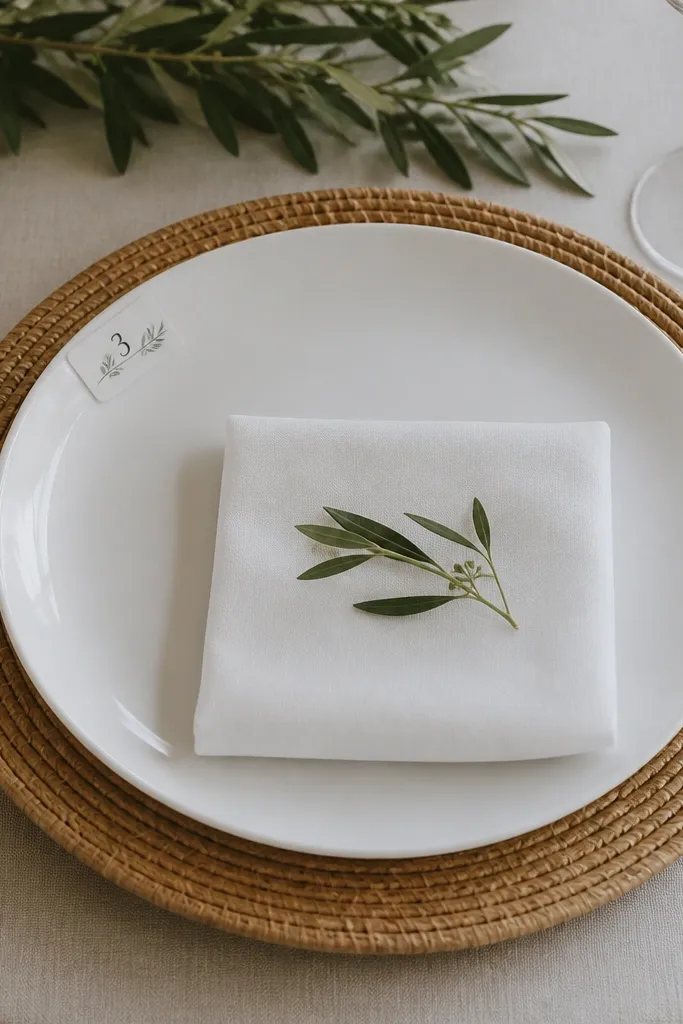
This is a clever way to add structure to place settings without making full place cards. Corner stickers look modern because they frame the table number without covering the charger. I like using one icon — like a tiny geometric dot or leaf — so the whole set looks cohesive.
Cut small vinyl rectangles about 1.25 x 1.25 inches and apply to the corner of charger cards or placemats. Put table numbers in a bold font and keep the rest minimal. Use matte vinyl and press firmly so edges don’t lift when guests bump the table.
Print a quick layout map before the wedding so you don’t swap table numbers late at night.
Avoid placing stickers too close to the edge — they peel from friction.
17. Foil-Look Vinyl Balloon Stickers for Table Numbers
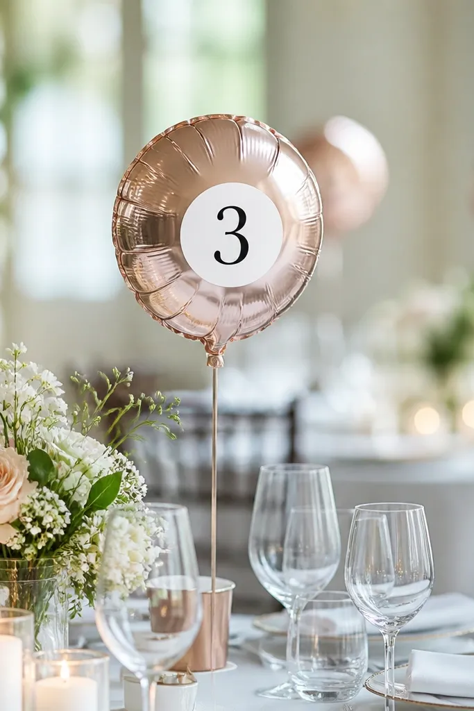
Balloons can look modern if you treat them like signage, not party decor. Metallic-look vinyl labels make balloons feel intentional, and table numbers become easy to spot. I use a single metallic tone across the set so it doesn’t look random.
Quick tipUse matte balloons if you can — metallic text on matte latex looks cleaner in photos.
Cut table number labels from metallic-look vinyl in a font that’s thick and readable. Keep labels small, around 2 inches wide, and place them near the balloon knot so they don’t twist around. Inflate balloons with a consistent size so numbers sit at similar angles.
One warningAvoid glitter vinyl — it catches harsh light and looks messy.
18. Custom Escort Card Envelopes With Address Labels
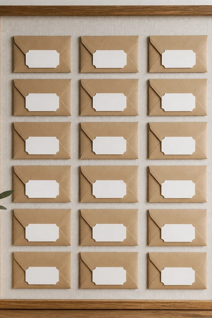
Escort cards look modern when they’re uniform and feel like stationery. Kraft envelopes with crisp labels give you texture plus clean typography. The display grid looks styled because every card has the same size and label placement.
Use kraft envelopes sized to fit a 3x4 inch card. Cut labels in matte vinyl or print then cut on label paper, then apply to the envelope front at a consistent height. Place on a display board with equal spacing, like 1 inch between cards.
Label the back of each envelope with table number in pencil so you can sort quickly during setup.
Avoid uneven label placement — guests notice even when they don’t say it.
19. Modern Cake Topper With Layered Vinyl on Cardstock
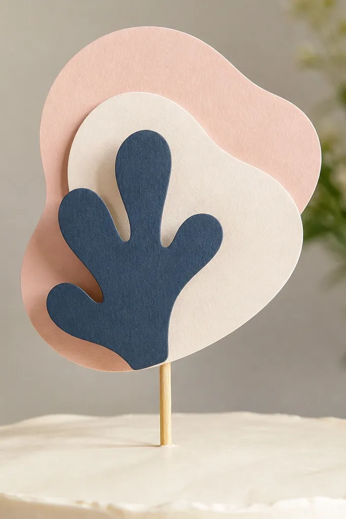
A layered topper gives you dimension without paying for a 3D printed piece. Vinyl-on-cardstock letters look clean and modern when you keep the shapes bold. I use two colors that match my signage palette so the topper ties the whole wedding together.
Cut base letters from thick cardstock and cut a second layer from matte vinyl or thinner cardstock in a contrasting color. Glue layers with a thin bead and mount on a skewer centered on the cake. Keep letter height around 6-7 inches so it’s visible without towering.
Seal cardstock edges with a clear matte spray if your venue has humidity.
Avoid flimsy cardstock — it bows and looks cheap when it’s photographed close.