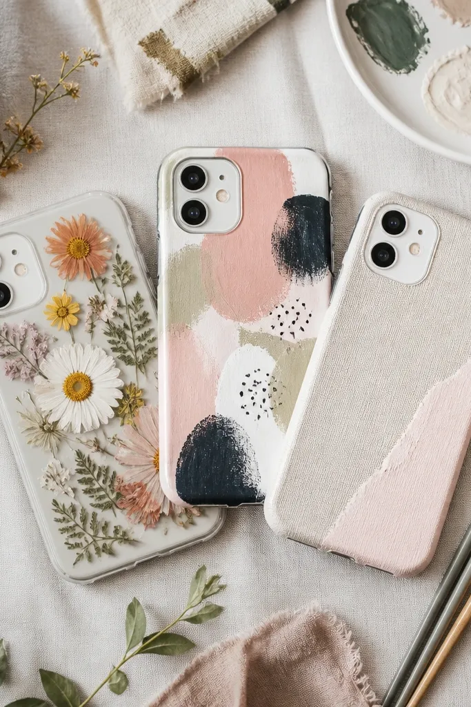
1. Chalky Corner Stripe with Tiny "Dot Stop"
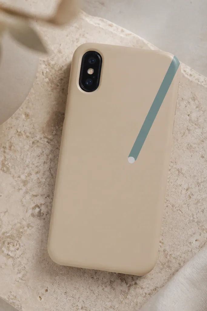
This design works because it keeps all attention in one small area and uses a matte background that hides brush texture. Dusty teal looks modern next to beige, and the tiny white dot gives the eye a clean finish without turning it into a busy pattern. The stripe is narrow enough that pocket wear doesn’t dominate the look. I’ve seen this exact combo on covers that get daily use and still look intentional after a few months.
Use a matte beige base cover (or paint a thin beige coat first). Mask a 6mm-wide diagonal stripe using painter’s tape, then paint with a damp foam brush so the chalky texture stays even. Add the 2mm white dot using a toothpick after the stripe dries 15-20 minutes.
Quick tipPress the tape edges down with a fingernail so the stripe edge stays sharp — peel slowly at a 45-degree angle.
One warningDon’t paint the stripe too wide — anything over 10mm starts looking like a sticker instead of a design.
2. One-Line Arch and Micro Star
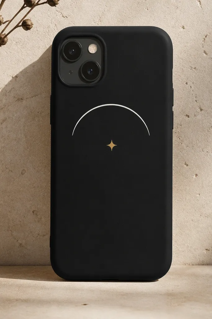
Minimalist art lives or dies by line consistency, and this one-line arch is forgiving because it’s just one shape. White on black reads clean in any lighting, and the small gold star adds warmth without adding clutter. I like it because it looks good from across a room and still feels personal up close. It also hides minor paint wear better than big filled areas.
Trace a shallow arch with a ruler and pencil directly on the cover (lightly) before painting. Paint the line with a size 0 liner brush or a paint pen loaded lightly. Add the star with a stencil or freehand using a toothpick for the points.
Quick tipIf your line breaks, don’t fix it by reloading the brush — just touch the gap with a second pass after it dries.
One warningSkip glossy topcoat — it makes thin lines reflect and look cheap.
3. Two-Tone Vertical Bands with Matte Fade
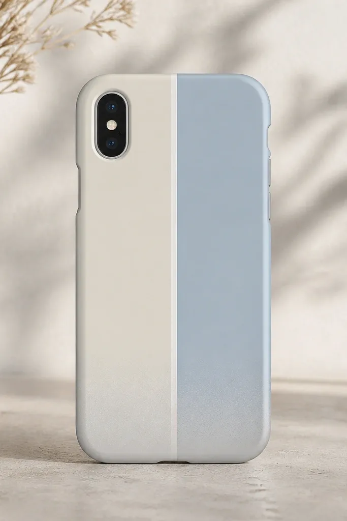
Vertical bands make the cover look taller and cleaner, and keeping them two-tone keeps it minimalist. The thin white divider gives the design a “graphic print” feel instead of a DIY smear. The matte fade at the bottom adds depth without turning into a full gradient painting. I’ve done this on kids' cases too because it doesn’t require perfect symmetry.
Mask two bands: make the left band 14mm wide and the right band 12mm wide, leaving a 2mm white divider strip. Paint cream and pale blue in thin layers. For the fade, dry-brush a tiny amount of the background gray into the bottom 8mm of each band.
Quick tipUse a dry foam brush for the fade — it deposits color softly instead of streaking.
One warningDon’t freehand the divider line — it’s the part that makes DIY look sloppy.
4. Minimalist "Postal Label" Rectangle
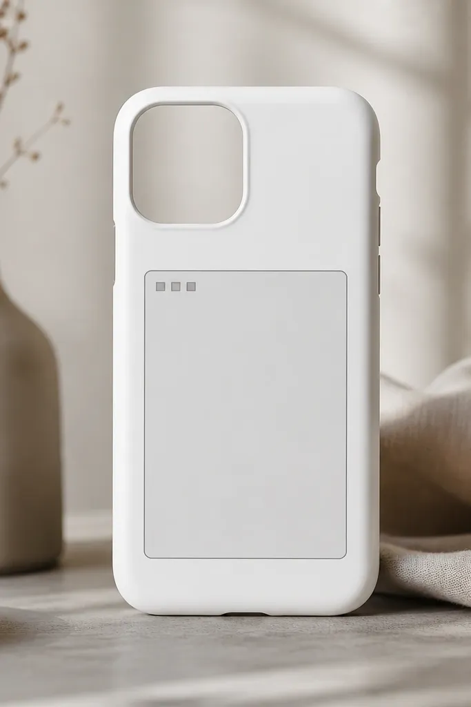
This is my go-to when you want something graphic but not loud. The label shape mimics a real-world object, so it reads modern even with simple colors. Light gray on white stays classy and doesn’t show scuffs as harshly as bright colors. The three square marks add a tiny bit of personality without breaking the minimalist rule.
Paint the whole cover white first if it’s not already. Mask a rectangle 30mm wide by 42mm tall, centered. Use a fine brush to outline a 1mm border inside the rectangle, then add three 3mm squares in the upper-left corner of the label area.
Quick tipLet the rectangle border dry fully before you remove tape so you don’t tear the edge.
One warningDon’t use chunky paint — the border edge should look like printed ink, not raised craft paint.
5. Tiny Geometric Tiles in One Corner
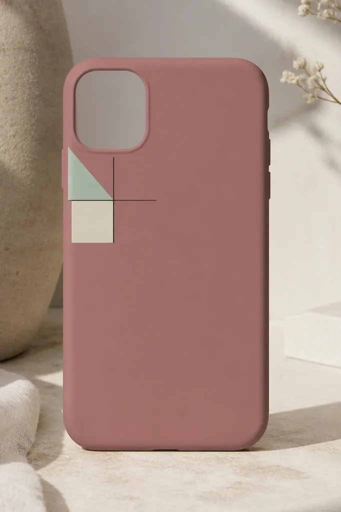
One-corner tile clusters look intentional because they follow the natural way we hold phones — the top-left stays visible in photos. The mint triangle and cream square provide contrast without adding many colors. Thin black lines connect the shapes and make the cluster feel designed instead of accidental. This one is great for kids because it’s easy to place and forgiving if a line isn’t perfect.
Pick a base color (dusty rose works great). Use a vinyl stencil or cut small tape shapes to create a 3-shape cluster inside a 22mm square area. Paint mint first, then cream, then finish with a thin black outline line around the cluster.
Quick tipIf you don’t have stencils, cut tape with scissors and press each piece down with a flat card to prevent paint bleed.
One warningDon’t spread shapes too far — if the cluster touches the edges, pocket wear will distort it fast.
6. Monochrome "Wave Tick" Border
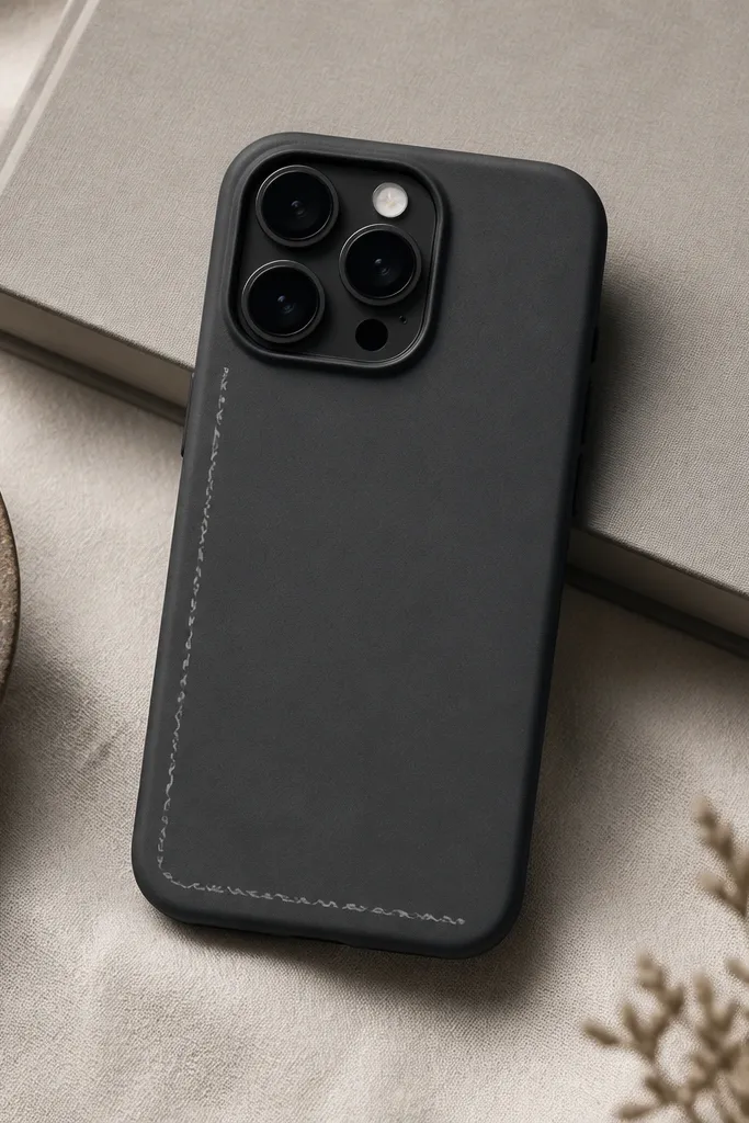
Borders make a phone cover look finished, and wave ticks keep it playful while still minimalist. Monochrome color keeps it grown-up — charcoal plus light gray looks clean in any room. Because the pattern stays near the edges, you get an easy frame effect. I like this for people who want art without big center graphics.
Mask a border path about 8mm from the left and bottom edges. Use a liner brush to paint small wave ticks about 3mm long, evenly spaced. Finish with a matte topcoat so the border doesn’t glare under sunlight.
Quick tipMark tick spacing with a ruler first — 6-7 ticks per 10mm looks balanced.
One warningDon’t paint the border too thick — thick borders chip at the edge sooner.
7. Micro Floral Linework (Single Bloom)
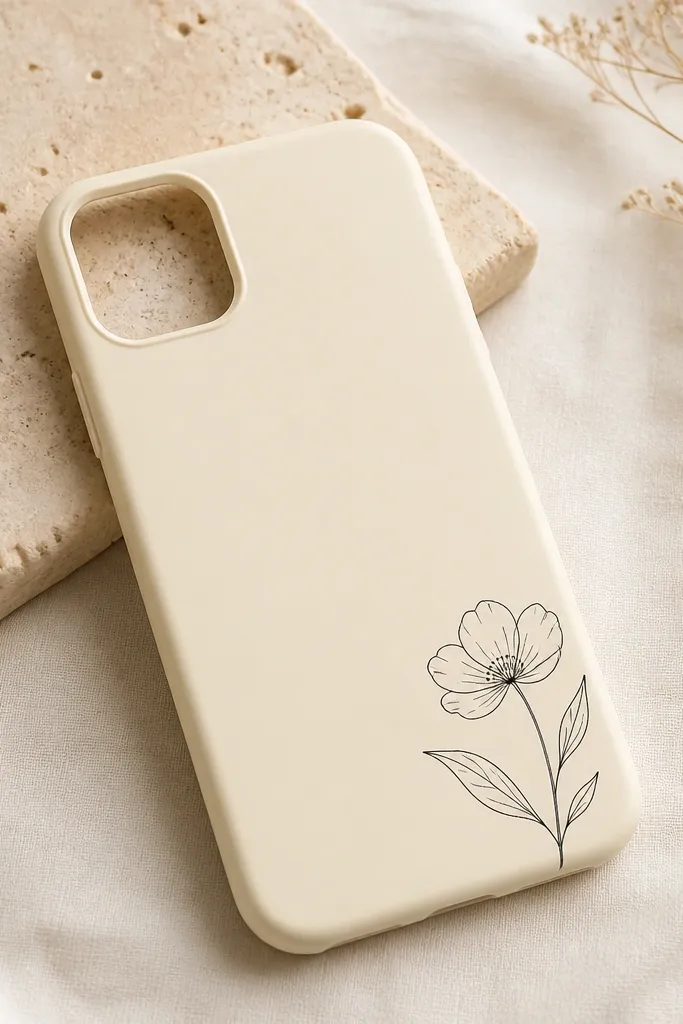
A single bloom keeps floral art from turning into a busy print. Linework looks sharp even with imperfect brush control, and black ink-like paint reads modern. The bottom-right placement feels natural when you set the phone down on a table. This style also hides wear because the design is thin and stays flexible under topcoat.
Use a size 0 or 00 brush for outlines. Draw the flower about 18mm wide, then add three leaves as simple curved lines. Fill nothing — keep it outline-only for that minimalist look.
Quick tipPractice the curve of one leaf on scrap tape first so your wrist motion matches the cover.
One warningAvoid filling large areas — filled floral shapes crack sooner on flexing covers.
8. Matte Marble Accent with One "Vein"
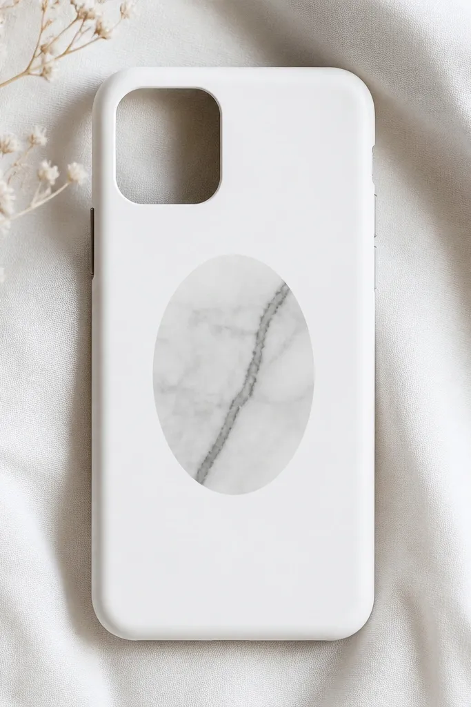
Marble usually looks fancy, but you don’t need full coverage to get the effect. A small oval accent keeps the design modern and controlled. The single dark vein makes the marble read as marble instead of random swirls. Matte paint helps it look like stone, not like a sticker.
Mask an oval about 38mm wide and 44mm tall at the center. Sponge on light gray and slightly darker gray in 2-3 passes, then drag one vein line with a fine brush. Keep the marble area small so it doesn’t get worn at the edges.
Quick tipUse a makeup sponge and blot — swirling too much makes it look muddy.
One warningDon’t use metallic paint for the vein — it turns the look tacky on matte cases.
9. Pastel "Privacy Stripe" with Rounded Corners
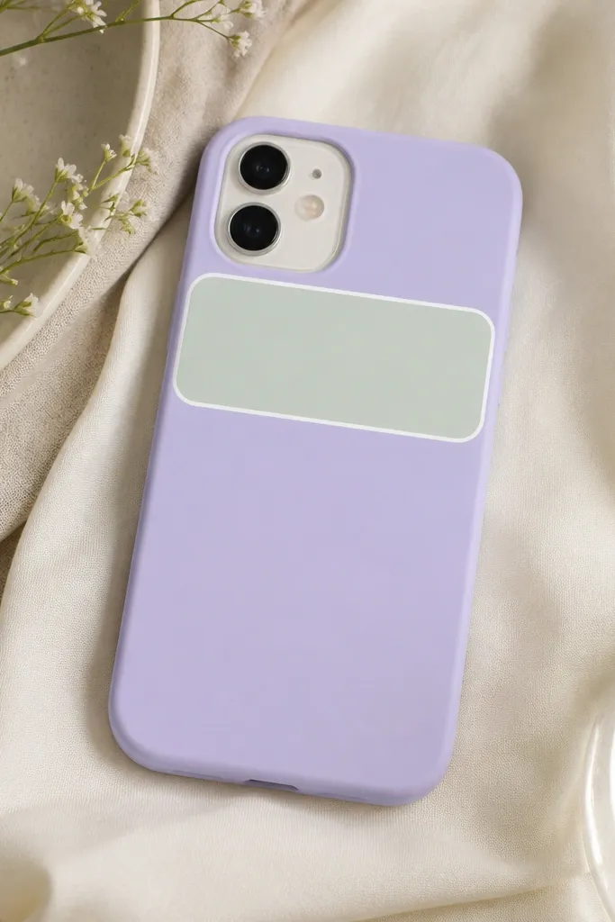
Rounded rectangles look modern, and the privacy-stripe vibe is clean without being loud. The mint stripe against lavender reads soft but still graphic. The thin white border makes the shape pop and keeps edges crisp. I like this because it photographs well and doesn’t look like a kids' craft once sealed.
Mask a rounded rectangle using tape cut with a small circle cutter or folded paper template. Make the stripe 16mm tall and span 70% of the phone width. Paint mint in thin layers, then add a 1mm white border after it dries.
Quick tipPeel tape after 10-15 minutes, not after an hour, so the edge stays clean.
One warningDon’t paint under the tape edge — it will create a raised ridge that feels cheap.
10. Minimal "Label Numbers" (1-9) Pattern
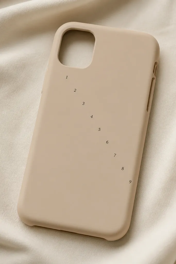
Numbers make a minimalist cover feel designed because they look like typography. A 1-9 diagonal line creates rhythm without needing icons. Black on beige stays calm, and the tiny scale keeps it from looking like a calendar. This one is great for kids too — they love choosing the number order.
Use a tiny stencil font sheet or handwrite with a paint marker. Place the first number about 10mm from the top-left edge, then space each number 6-7mm apart diagonally. Keep the numbers consistent thickness using a marker with controlled flow.
Quick tipLet the numbers dry fully, then seal with matte topcoat to prevent smudging in pockets.
One warningSkip thick outlines on numbers — they look like stickers when sealed.
11. Two-Color Split with Diagonal "Paper Cut" Edge
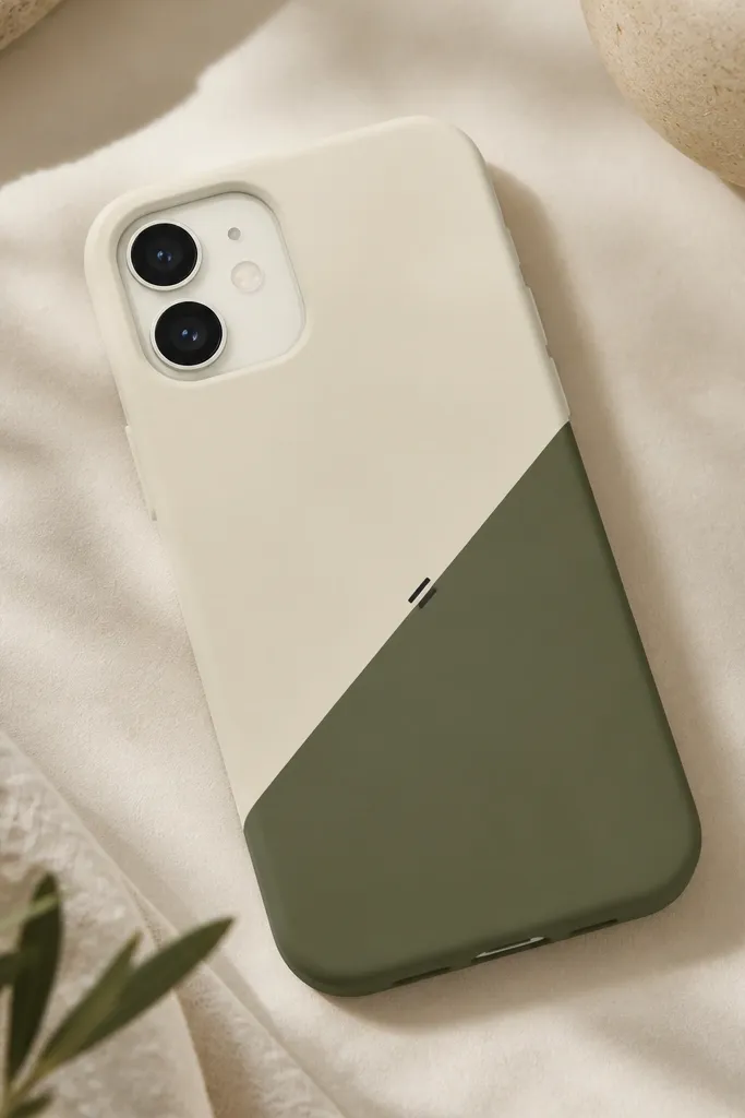
Diagonal paper-cut edges look modern because they mimic design prints. Using cream and olive keeps it grounded and not overly bright. The boundary line is the whole point, so it needs crisp tape work. The tiny tick mark adds a subtle detail that makes the design feel intentional.
Mask a diagonal boundary at a 30-degree angle across the cover. Paint both sides in thin coats; let cream dry, then olive. Add one 5mm black tick on the boundary near the center after both colors cure.
Quick tipUse a fresh tape strip for the diagonal edge — old tape lets paint seep under.
One warningDon’t rush to peel — if paint is still wet, the edge will smear.
12. Minimal Dot Grid with One "Missing" Spot
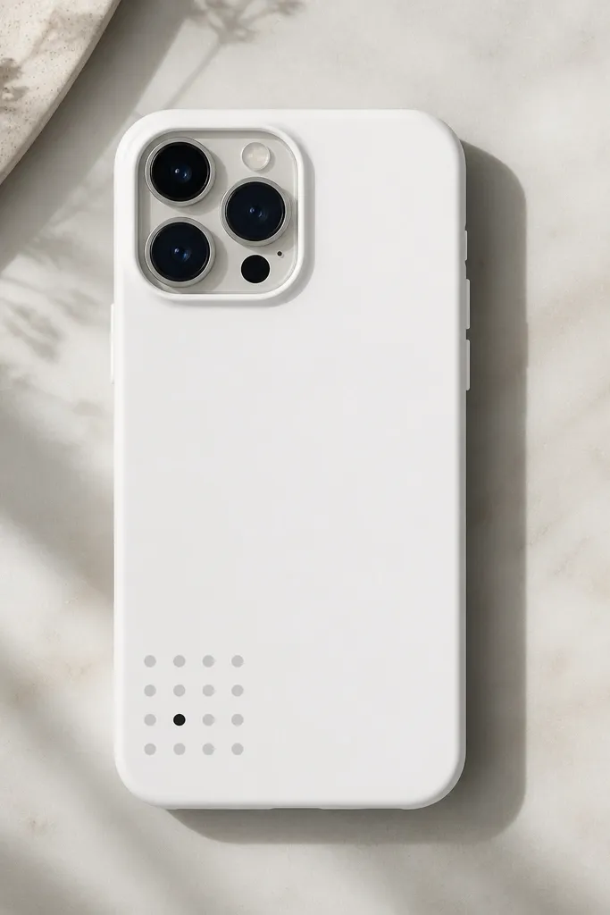
A dot grid reads minimalist because it’s structured and predictable. The missing spot trick adds a tiny surprise that feels graphic, like modern design posters. Light gray keeps it subtle, and the single black dot gives focus. This pattern also hides small chips because dots are small and spaced.
Mask a 28mm square area in the bottom-left. Use a dotting tool or the end of a round toothpick to place 15 light gray dots, skipping one spot. Place a black dot exactly where the missing dot would be, same size as the others.
Quick tipCount dots with a quick grid sketch on paper first so spacing stays even.
One warningAvoid uneven dot sizes — one big dot makes the whole grid look messy.
13. Monochrome Frame with One Corner Accent
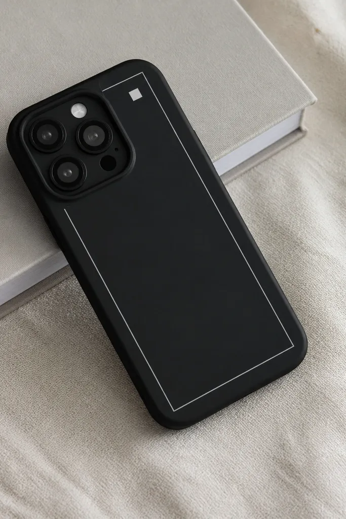
A frame makes the cover look like it has a design border, and keeping it inset makes it feel intentional. One corner square adds interest without cluttering the center. Monochrome choices make the finish look clean even after you’ve carried the phone for weeks. This one is also easy to scale if you have a different phone model.
Mask a rectangle about 6mm inside the cover edges. Paint a 2mm-wide light gray frame line — don’t fill it, just outline. Add a 6mm white square at the top-right corner inside the frame.
Use painter’s tape for the outer rectangle, then a second strip as an inside guide so the line thickness stays consistent.
Don’t let the frame touch the corners — wear will knock it out quickly.
14. Soft Ombre Edge Fade (No Center Color)
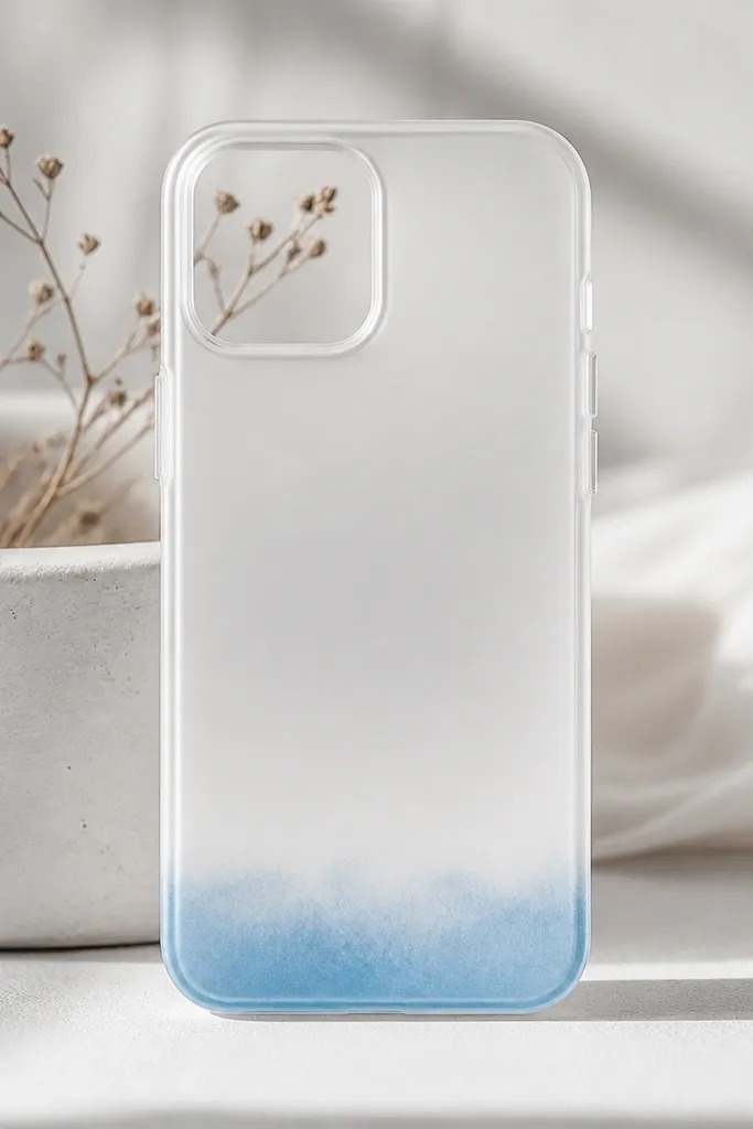
Edge fades look modern because they mimic ink soaking into paper, not a full gradient. Keeping the color only along the bottom edge reduces the chance of visible chipping. Pale blue on white stays calm and looks good in photos. I’ve had this look survive school backpacks because the design sits where scuffs are easiest to blend.
Mask off everything above the bottom 15mm. Sponge pale blue acrylic in 3 passes, each pass lighter and higher. Use a slightly damp sponge to blend the top edge of the fade so it looks soft.
Quick tipBlend with a clean dry sponge for 10 seconds after the last coat to remove harsh lines.
One warningDon’t paint a hard horizontal line — that’s the giveaway of DIY.
15. Minimal "Sunrise" Half-Arc
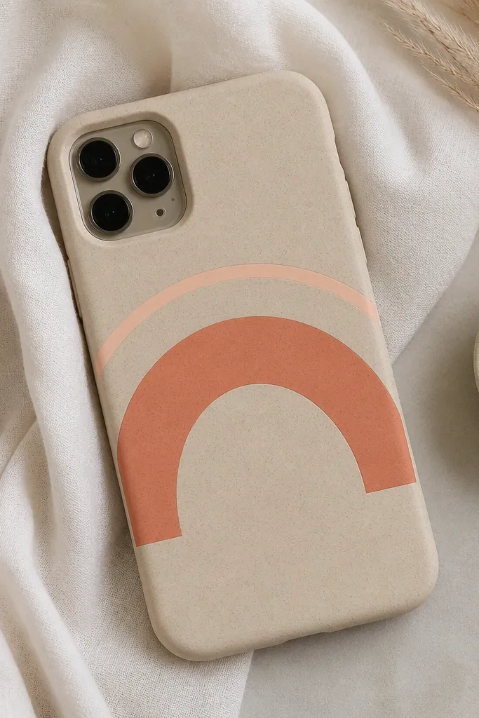
A sunrise half-arc gives motion without getting busy. Two arcs — one thick-ish coral and one thin peach — create depth while staying minimalist. Sand base keeps it warm and not too bold. This design looks good on both kids' covers and adult covers because it’s simple and cheerful.
Mask two arcs centered near the top third. Make the thicker arc about 10mm tall and 32mm wide, and the thinner arc about 6mm tall. Paint coral first, let dry, then peach on top of the coral edge for a layered look.
Quick tipIf your arc looks wobbly, repaint only the top third — that’s where your eye judges shape.
One warningAvoid full circles or multiple rays — they stop reading as minimalist.
16. Matte Metallic Outline on a Flat Icon
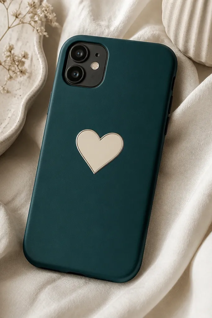
The trick here is keeping the icon filled solid and the outline thin. Metallic silver used as a line accent looks clean, especially on matte teal. The cream fill stays readable, and the thin outline gives that “sticker-free” polish. I use this for gifts because it looks like it came from a design store.
Paint the heart filled cream using a stencil or drawn outline with tape. Once dry, mask the heart edge and paint only the outline with metallic silver paint mixed with a tiny bit of matte medium so it doesn’t glare. Seal with matte topcoat so the metallic line stays smooth.
Quick tipUse metallic paint sparingly — one thin coat is enough for a clean outline.
One warningDon’t flood the outline — metallic paint that’s too thick chips fast.
17. Minimal Leaf Silhouette with Negative Space
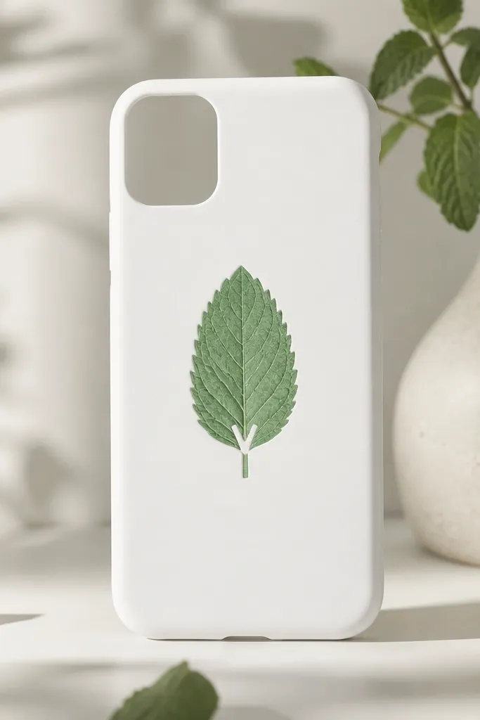
Negative space makes silhouettes look modern. The mint leaf on white feels fresh, and the V notch makes it look like a designed icon instead of a random leaf drawing. This works because the design doesn’t rely on lots of brush texture. It’s also forgiving if you don’t get perfect edges — the silhouette still reads.
Trace a simple leaf shape on the cover using a printed template. Mask the leaf area with tape, leaving the V notch unpainted by placing a small tape cut at the notch spot. Paint mint in thin coats, then remove tape while paint is slightly tacky for crisp edges.
Use a small craft knife to cut the tape notch — scissors make rounded edges that look off.
Skip shading — gradients inside the leaf look sloppy with minimalist silhouettes.
18. Monogram Corner Cutout Look
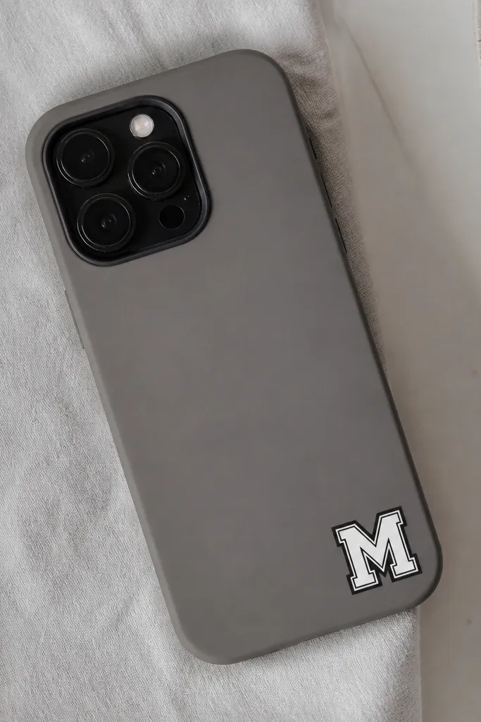
Monograms look minimalist when they sit in one corner and have a border. The cutout label vibe comes from the contrast between white letter and gray background. Adding a thin black border makes the letter feel crisp and intentional. I like this style for school kids because it’s easy to personalize without changing the whole cover design.
Pick one letter and size it about 26mm tall, placed 10mm from the bottom and right edges. Mask the letter shape with tape or stencil, paint white, let dry, then outline with a thin black border. Keep the border line about 1mm thick so it doesn’t look heavy.
Quick tipIf your letter has curves, paint the border first, then fill the letter — it prevents bleed at the curve edge.
One warningDon’t use a thick marker-style font — it makes the cover look like a kid’s sticker.
19. Grid Lines with One Bold Intersection
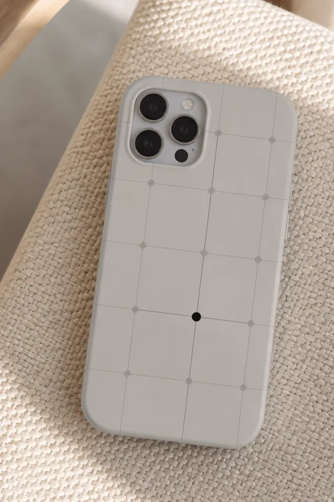
A light grid looks modern when the lines are faint and consistent. The bold intersection point is the minimalist focal point and it keeps the design from feeling like graph paper. This is a great makeover for people who love structure but don’t want anything too decorative. It also hides minor paint wear because the faint lines fade together.
Mask a rectangle area about 60% of the phone width and 70% of the height. Use a ruler to mark grid lines at 10mm intervals, then paint thin lines in a slightly darker gray. Paint one intersection with black as a 4mm dot.
Quick tipUse a ruler and keep your brush mostly vertical for straight lines.
One warningDon’t make every intersection equal — that turns it into a full dot grid instead of a focal design.
20. Color Block "Book Spine" with Spine Numbers
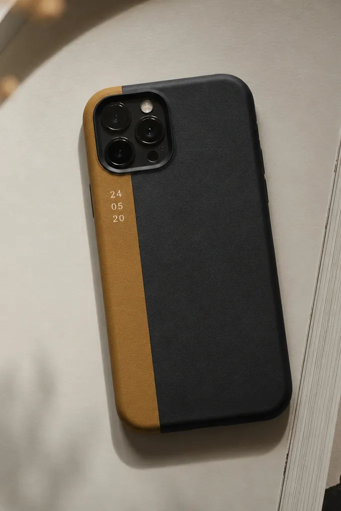
A book spine motif feels clever but still minimalist because it’s one vertical block plus tiny type. Muted mustard on black reads warm and modern, and the small stacked numbers feel like a label. This design looks good even when the phone is face-down because the spine area catches light. I’ve used it for teacher gifts and it always gets comments.
Mask a vertical block 18mm wide on the left side, starting 12mm from the top and stopping 20mm above the bottom. Paint muted mustard in thin coats. Add small white numbers (like 7 and 3) with a stencil or paint marker stacked vertically inside the block.
Quick tipPress tape edges hard along the left side — that’s where chips show first.
One warningAvoid covering the whole left edge — leaving a margin makes it look designed, not patched.