1. Linen-Texture Gallery Wall With Wood Spacers
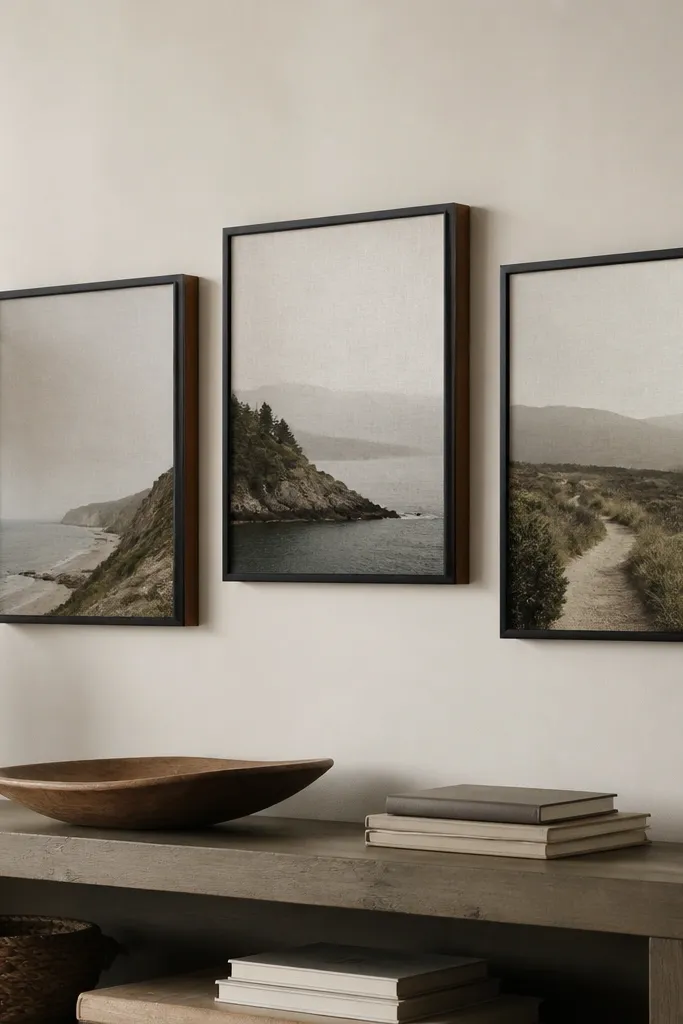
Start by picking three to five prints that share the same color family, ideally linen-look art or simple line work. Attach thin wood spacers behind each frame so there’s a 1/4 inch gap from the wall; I cut scraps with a miter box and sand the edges smooth. Lay the frames on the floor first, then mark the wall with painter’s tape at the exact heights using a level. Hang the center frame first, then place the rest so the bottom edges line up with the console or shelf below. Finish by hiding hanging hardware with a small strip of matching frame tape on the back edge.
This one works because it adds real depth, not just more pictures. The linen-look prints soften the room, and the light-wood spacers make the frames look like they’re floating, which reads expensive in warm light. I use black frames when the room has any dark furniture, and I use cream frames when the room has mostly light wood. It flatters rooms that feel “too clean” or modern — the texture warms everything up without adding clutter. For styling, keep the print colors muted — off-white, sand, faded sage — so it doesn’t fight your rug or bedding.
One warningDon’t mix glossy and matte frames — the shine mismatch makes the whole wall look DIY.
Quick tipUse matte acrylic spray on any glossy prints you already own to kill glare from overhead lights.
2. Oversized Framed Woven Panel Above a Bed
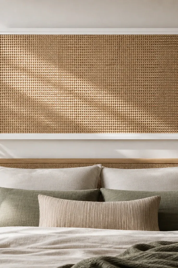
Start by buying a pre-woven panel or cutting a woven placemat sheet to a rectangle size you like, around 36x24 inches for most beds. Build a frame from 1x2 pine or MDF strips, then paint it the same color as your trim or bedding base. Screw the frame together and glue the woven panel to the inside edge with hot glue, then add a thin border strip so the edges don’t fray. Center it above the bed so the bottom of the frame sits about 6-8 inches above the headboard top. Hang with two sturdy D-rings and a wall anchor, not just one hook.
A woven panel turns a plain wall into something sculptural. The weave texture reads high-end even when the materials are simple, and the big size makes the room feel designed. I’ve put this above both a low platform bed and a taller upholstered headboard; the woven texture adds contrast so the bed doesn’t blend into the wall. If your room has beige walls, this gives you warmth without adding color chaos. It also flatters smaller rooms because the panel creates a focal point that makes the space feel intentional.
One warningDon’t use a frame color that clashes with your curtain rod or baseboards — that mismatch shows up immediately.
Quick tipIf the weave looks too light, brush a tiny amount of diluted brown acrylic over the high points to deepen the shadows.
3. Floating Shelf With Built-In Cable Hide
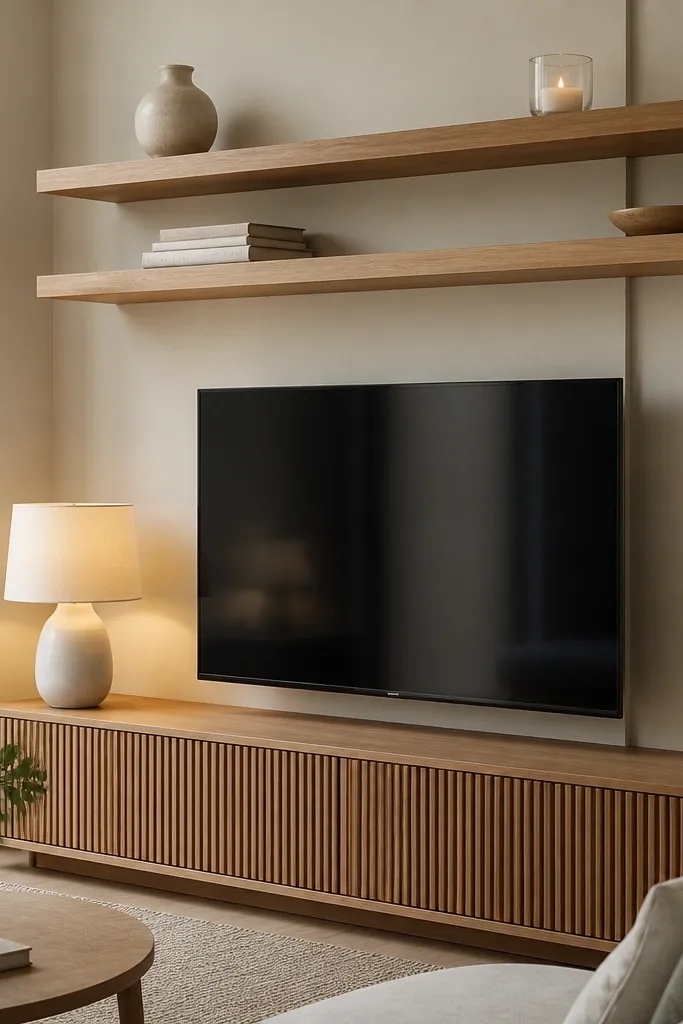
This is the DIY trick that makes rooms look clean and expensive — cords disappear. Floating shelves also create vertical styling without taking floor space, so your room feels taller and more curated. I like warm oak or walnut-toned shelves because they blend with most rugs and bedding, and the shelf edge looks intentional in photos. It flatters living rooms that feel cluttered or “tech-heavy” where the TV area dominates. The best part is the shelf becomes a stage for decor, so you can keep changing small items without redoing the room.
Start by measuring the TV or console zone and picking a shelf length that’s about 2/3 the width of the wall you’re styling. Mount the shelf with hidden brackets or a ledger system that lets you level it perfectly; use a stud finder. Before you place decor, install a simple cord channel behind the shelf line and run cords through it, then tape the channel so it doesn’t rattle. Style in three layers: a taller vase or plant on one end, a book stack near the center, and a small candle or framed photo cluster on the other end. Keep the tallest items toward the corners so the middle looks airy.
Paint the bracket backs the same color as the wall so you don’t see hardware in side light.
Don’t crowd the shelf — if every inch is filled, it looks like storage, not decor.
4. Thrifted Frame + Scrapbook Paper Color Matting
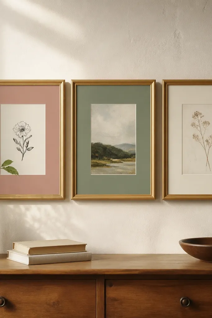
This is my go-to when I want expensive-looking art without buying expensive prints. Custom matting makes cheap prints look like gallery pieces because it controls spacing and color temperature. I’ve done this with family photos too — the right mat color makes skin tones look warmer and less flat. It flatters rooms that already have a color accent, because you can match the mat to curtains, pillows, or a throw blanket. The secret is the mat color — dusty rose and sage look luxe when paired with cream and brushed gold.
Start by sanding any rough thrift frame edges, then paint or rub with a metallic glaze so the finish looks consistent. Cut scrapbook paper mats to fit the frame opening with a 1/2 inch mat border, using a ruler and a craft knife. Dry-fit the print and mat so the image sits centered and the border is even. Insert the print behind the mat, then use foam tape on the back corners so it sits flat and doesn’t sag. Hang the set with matching hooks so the frames sit at the same height.
Use cotton rag paper for the mat if you have it — it looks less plasticky than standard scrapbook sheets.
Don’t use bright neon mat colors — they make the whole frame look like a craft project.
5. Macrame-Style Rope Wall Hanging Using a Dowels-Not-Knots Method
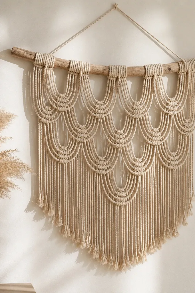
The reason this looks expensive is the shape and the spacing. A single main dowel gives it structure, and the rope fringe creates movement without looking bulky. I use this in rooms with plain walls because it adds texture that doesn’t compete with furniture patterns. It flatters people who want a boho vibe but don’t want the thick, messy knot look. Under evening light, the rope strands create shadow lines that feel designer.
Start by cutting rope lengths about 2.5 times the finished hanging height so you have enough for the fringe. Thread the rope through a dowel using a simple loop method: fold each rope in half, then pass the folded end through a gap and pull tight. Space the loops evenly across the dowel by laying them out on the floor first and spacing with painter’s tape marks. After you hang it, trim the bottom fringe to a straight line or a slight arc for softer look. Tie a small rope loop at the top center for hanging and secure it with a hidden knot behind the dowel.
Lightly mist the rope with water and stretch it before trimming so the fringe looks uniform.
Don’t hang it too low — if the fringe hits eye level, it reads messy instead of intentional.
6. Painted Terracotta Stacked Wall Planters
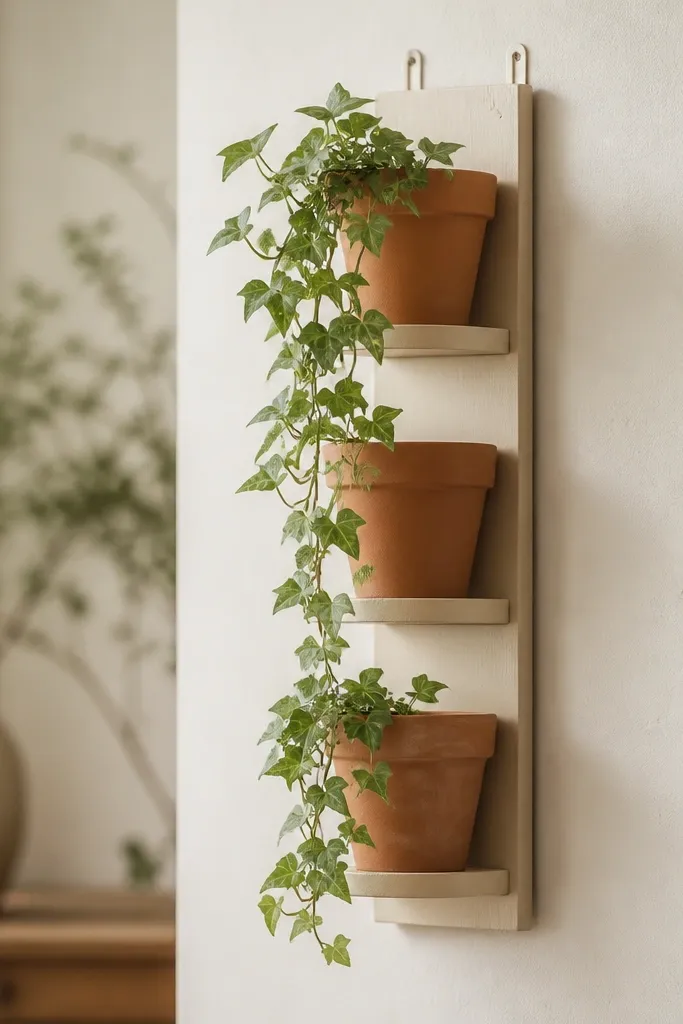
Start by selecting three small pots with the same opening size, then drill drainage holes if needed and add saucers. Paint the pots matte cream and let them cure overnight so they don’t scratch. Mount the pots to a thin wooden board using a hot glue gun plus small screws through the board into the pot base for extra hold. Leave 1-1.5 inches between pots so leaves can breathe. Mount the board at eye level or slightly above and run a trailing plant so it drapes down the front.
Plants look expensive when the containers look cohesive and the mounting is clean. This stacked planter setup turns three separate pots into one designed piece. I like terracotta because it naturally warms a room, and painting it matte cream makes it feel high-end instead of rustic. It flatters rooms that need life but don’t have space for a floor plant. The spill-down greenery also softens sharp furniture lines like a boxy dresser or desk.
One warningDon’t mount pots directly on drywall without anchors — the board can pull loose once the plant grows.
Quick tipUse sphagnum moss in the top pot and press it tight so the plant establishes faster.
7. Coffee Table Styling Tray in Faux Marble Paint
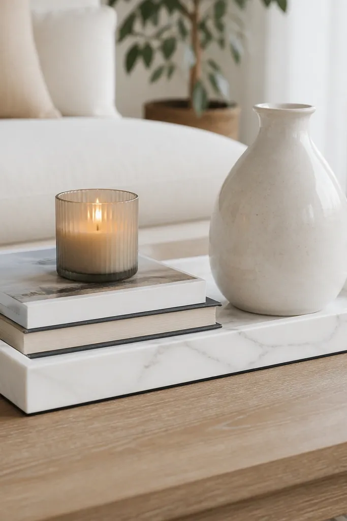
Start with a simple wooden tray and sand it lightly so paint sticks. Prime with white bonding primer, then paint the tray with a smooth satin white base. Add veining using a small fan brush and gray paint: drag thin lines, then lightly feather edges with a damp cloth. Finish by outlining the tray edges with a very thin line of black or dark gray paint so it looks framed. Let it cure, then style with a candle centered, a vase slightly off-center, and a book stack that’s no taller than the tray rim.
This is one of the fastest ways to make decor look expensive because it upgrades the stage. A marble-looking tray makes everything on top feel intentional, even thrifted items. The white base brightens a room, and the gray veining adds depth that reads like stone. I use this when my surfaces look too plain, like a beige coffee table or a laminate top. It flatters warm-toned spaces because gray and white pair with wood and cream bedding.
One warningDon’t use thick swipes for veining — chunky lines look like paint, not stone.
Quick tipSeal with a clear matte topcoat so the tray doesn’t get sticky-looking under sunlight.
8. Draped Throw Blanket on a Chair With Hidden Clips
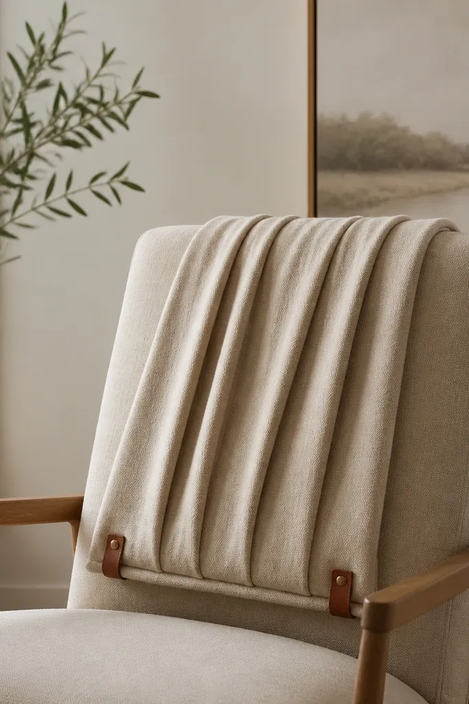
Start by choosing a throw that’s at least 50 inches wide so it drapes with real weight. Place the blanket over the chair back so one side falls straight and the other creates a gentle fold; tuck the fold edge under itself. Use small binder clips or fabric clips behind the chair back to hold the exact fold line. Smooth the top with your palm so it lies flat, then tug the bottom edge down to create a consistent height. Finish by adding one small accent pillow or a book under the drape for balance.
This looks expensive because the folds look controlled, not random. A blanket that slips looks casual in a bad way; when it stays put, it reads styled. I use a thick knit or a textured weave in cream, oatmeal, or taupe because the fabric holds shape. It flatters rooms with hard surfaces like wood floors and metal frames by adding softness at eye level. Also, it’s a perfect trick for renters because you can remove it without marks.
One warningDon’t drape too short — if it ends above the seat, it looks like a towel.
Quick tipIf your blanket is slippery, rub the underside lightly with a tiny amount of fabric grip spray.
9. Corner Reading Nook: Floor Lamp DIY Shade With Linen Fabric
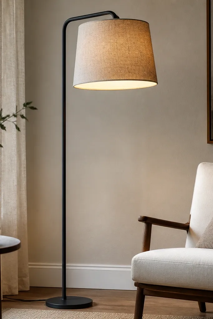
Start by buying a lamp shade frame that fits your lamp base, then measure the circumference and height with a tape measure. Cut linen-look fabric with a little extra seam allowance and iron it so it lies flat. Spray the shade frame with fabric adhesive, wrap the fabric around evenly, and smooth it in sections so it doesn’t ripple. Add a thin inner lining in warm white so the light stays bright. Reassemble and test with the bulb — if light looks too dim, pick a warmer 2700K bulb.
A custom shade makes a lamp look designer because it changes the quality of light. Linen-look fabric diffuses the bulb into a soft amber glow instead of harsh white. I do this in corners where the room needs warmth but overhead lighting feels too bright. It flatters dark furniture and deep rugs because the shade lightens the area without changing your palette. If you want the Pinterest “cozy but grown-up” vibe, this is the fastest lever.
One warningDon’t let the fabric seams land on the front — it reads like a craft mistake.
Quick tipUse a warm-white bulb and a dimmer if you have one; the linen texture looks best at lower brightness.
10. No-Sew Faux Leather Headboard Trim for Plain Beds
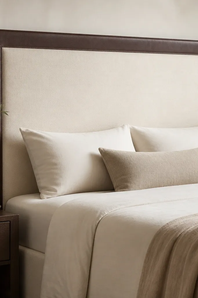
Start by cleaning the headboard surface so adhesive sticks. Cut faux leather trim strips to match the headboard edges, and miter the corners at 45 degrees for a sharp look. Use fabric glue or strong adhesive tape made for upholstery along the back edge, then press the trim into place slowly, smoothing as you go. Add a second thin strip in the center if you want a more tailored look, but keep it symmetric. Let it set for the full cure time before making the bed so the edges don’t lift.
Plain headboards look unfinished. A trimmed border makes the bed feel tailored, like it came from a furniture store. Faux leather in dark brown or black adds a subtle shine that reads expensive without being flashy. I’ve used this on foam headboards and simple upholstered frames; it gives them a crisp edge and makes the bedding look more curated. It flatters neutral rooms because the border creates contrast and frames your pillows. The effect is also great when your room has a lot of soft fabric and needs one structured element.
One warningDon’t skip corner mitering — straight seams at corners look cheap fast.
Quick tipUse a hair dryer on low heat to help the faux leather conform around curves.
11. Rattan Basket Pendant Wall Light With Plug-In Cord
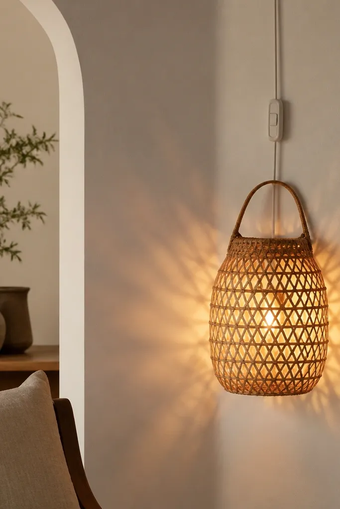
Start with a rattan basket that has enough space to fit a small bulb and socket inside. Remove any sharp hardware from the basket and sand rough edges. Insert a plug-in pendant kit into the basket center so the socket sits stable, then secure with hot glue and a small zip tie around the internal frame. Run the cord along the wall edge and cover it with a paintable cord channel for a clean look. Turn it on and adjust the basket height so the light hits at eye level or slightly above for flattering shadows.
Rattan makes light look expensive because the weave turns the bulb into a pattern. You get soft texture on the wall instead of a plain light spot. This works in hallways, dining areas, or bedroom corners where you want something decorative without adding another floor lamp. It flatters minimal rooms because the basket brings texture while staying neutral. Also, it’s a good solution when you can’t wire a real pendant.
One warningDon’t use a bulb that runs too hot — woven baskets can darken around the heat source.
Quick tipUse a warm 2200K-2700K bulb so the basket glows honey-gold, not yellow-green.
12. Layered Bedside Styling: DIY Tray + Floating Candle Sconce Look
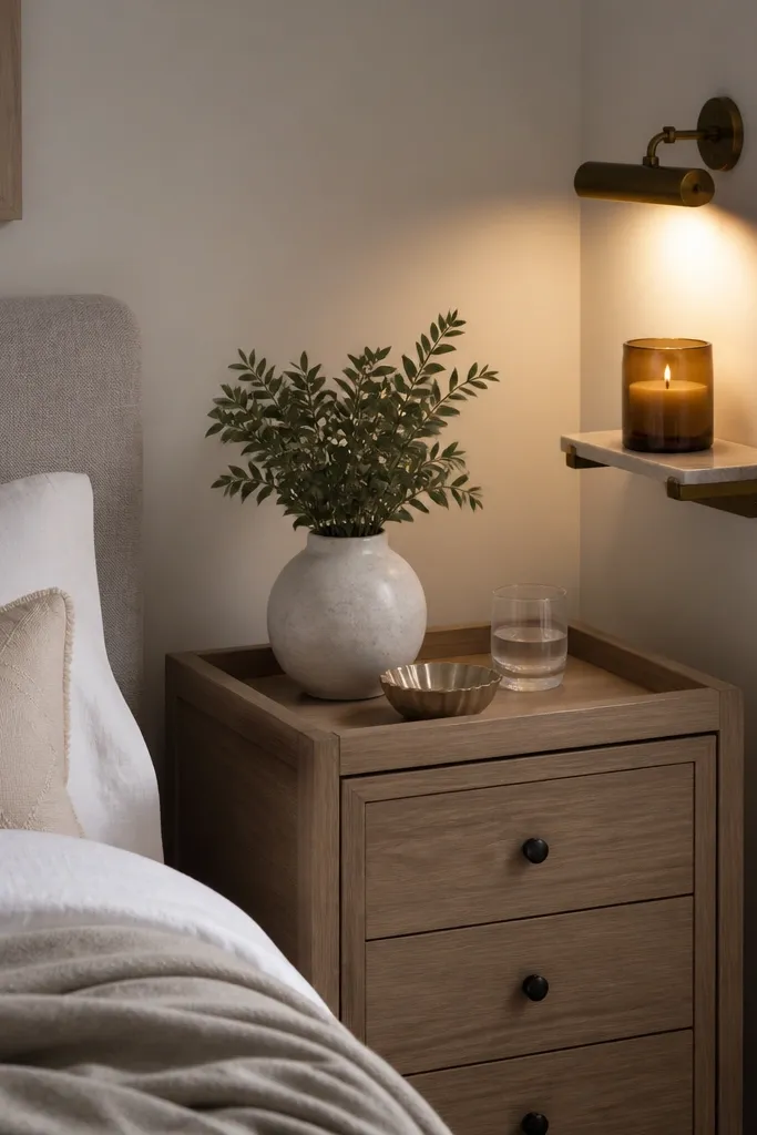
Start by making a small tray from a thrifted serving board and painting it matte white or warm black. Mount a mini shelf or picture ledge near the bedside and attach a small plug-in picture light aimed downward. Place a candle jar on the ledge so the glow bounces across the wall, then put the tray on the nightstand with one book and one ceramic piece. Keep the candle off the main tabletop if you’re worried about heat; use it for visual rather than long burning. Step back every time and make sure the vertical candle line lines up with the bed pillow height.
The expensive look at night comes from light placement and tidy grouping. A small tray keeps your candle and small decor from scattering, and the sconce-style light adds a glow that makes the whole room feel styled. I like this when your nightstand is narrow and a full wall sconce would crowd the wall. It flatters bedrooms with patterned bedding by giving the eye a clean, light-driven focal point. The styling rule is simple: one glowing element, one textured element, and one vertical element.
One warningDon’t place three small items where one glow would do — the bedside turns into clutter.
Quick tipWrap a thin piece of linen around the candle jar base so the label doesn’t show in photos.
13. Fabric-Covered Binder Clip Wall Organizer for Keys and Mail
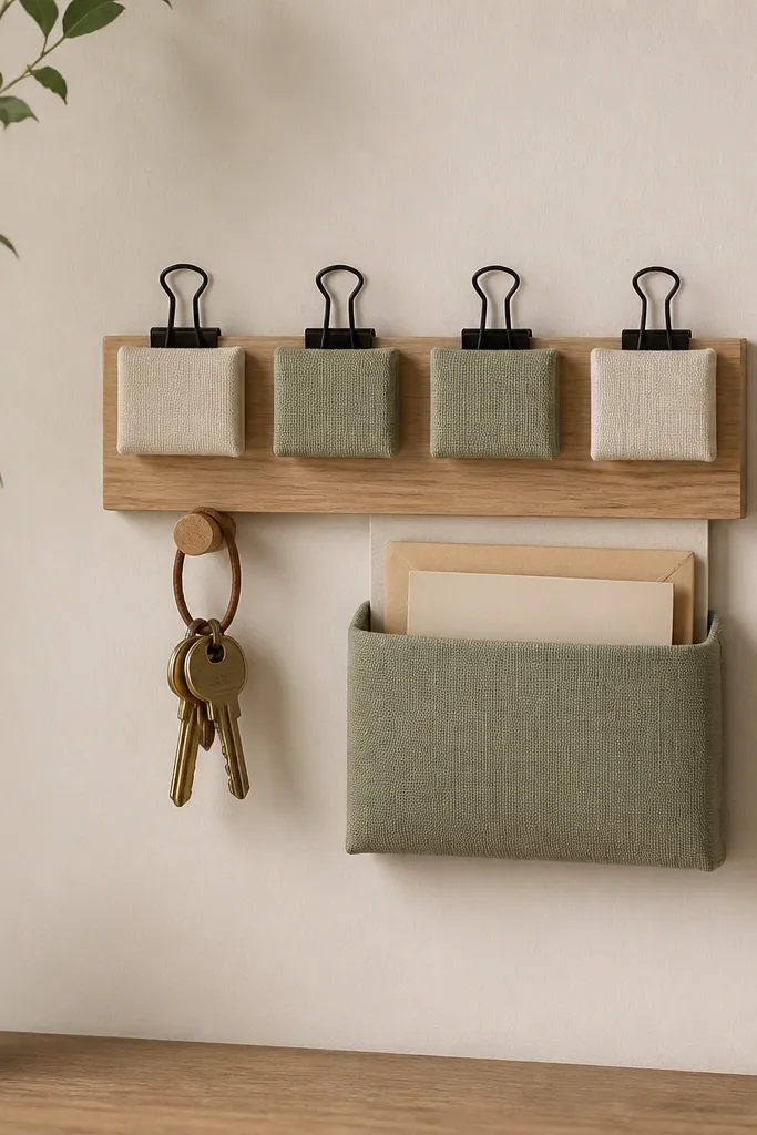
Start with a wooden strip cut to your preferred length, about 12-18 inches. Attach binder clips evenly across the strip using small screws, then slide on fabric sleeves made from scrap cotton or linen. Add a small mail pocket under the clips using a simple envelope-style fabric pouch attached with Velcro. Mount the strip at chest height for easy access, then add a hook or two for keys. Style by clipping one small note or card and hanging a single tray for loose change.
This is an underrated decor hack because it looks like a design feature, not a storage system. The binder clips create a repeating pattern, and fabric sleeves keep the hardware from looking industrial. I use this near entryways and kitchens where mail piles up and makes the whole house feel messy. It flatters compact spaces because it’s vertical and narrow. When you match the fabric to your curtain or throw color, it reads intentional and expensive.
One warningDon’t use mismatched fabrics — two scraps fighting each other looks like leftover craft supplies.
Quick tipUse heat-bonded interfacing inside the fabric sleeves so they keep a crisp shape.
14. DIY Oversized Floor Mirror Frame From Door Slats
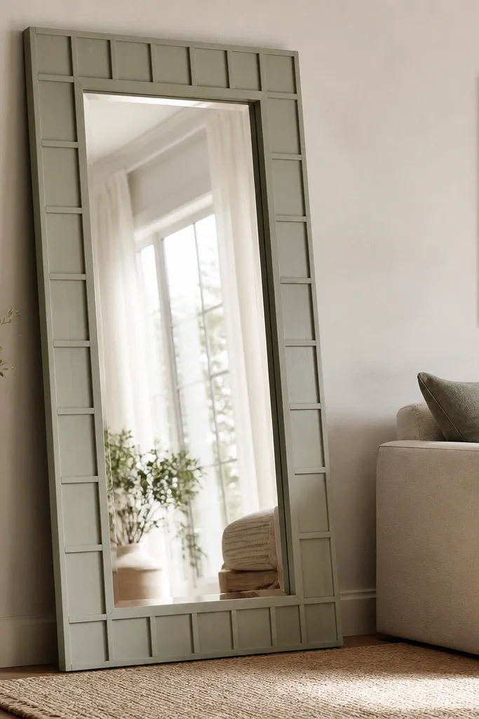
A mirror makes a room look finished because it adds depth and light reflection. The DIY part is the frame: wood slats create a custom look without buying an expensive designer frame. I do this when a room needs brightness and you have a blank wall next to the sofa or dresser. It flatters small rooms because it expands the visual space, and it flatters dark furniture because reflections bring contrast. Keep the mirror glass clear and the frame simple so it reads polished.
Start by buying a ready mirror panel or salvaging one that already has a backing and secure glass. Build a frame around it using door slats or 1x2 boards cut to width, then paint in matte off-white or warm black. For the slat style, attach slats vertically to the outer frame sides with small screws, leaving 1/4 inch gaps for shadow. Install mirror hangers or a sturdy leaning bracket so it can’t tip. Place it on a rug or mat so the frame doesn’t scratch the floor, then align it so it reflects the brightest window or lamp.
Add felt pads at the bottom corners so it stays stable on hardwood.
Don’t over-decorate the frame — too many details make it look costume-like.
15. Matte Black Wall Shelf With Ceramic Bud Vases
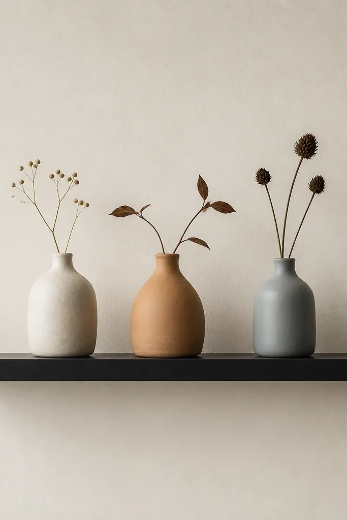
Start by finding a shelf with a lip or raised edge so items don’t slide. Paint or buy matte black brackets and shelf, then mount into studs or use heavy anchors if the wall is solid. Place three vases along the shelf: one tall, one medium, one small, spaced evenly. Add a tiny book under the smallest vase if you need height variation. For stems, use thin dried grasses or a single eucalyptus branch cut short so it sits at the vase height.
One simple shelf with matching ceramics looks expensive because it’s clean and repeatable. Matte black hardware gives a high-end contrast against light walls, and ceramic bud vases add texture without clutter. I like this for kitchens, hallways, and bedrooms where you want a decor hit but don’t want a big project. It flatters rooms with neutral walls because the shelf creates a designed line across the space. The styling principle is negative space: leave space between the vases and keep the flowers minimal.
One warningDon’t cram the shelf to the ends — it looks like you’re trying to fill space.
Quick tipWipe ceramics with a dry microfiber cloth before styling so they don’t look dusty under flash.
16. DIY Ombre Curtain Tie-Backs Using Fabric Dye
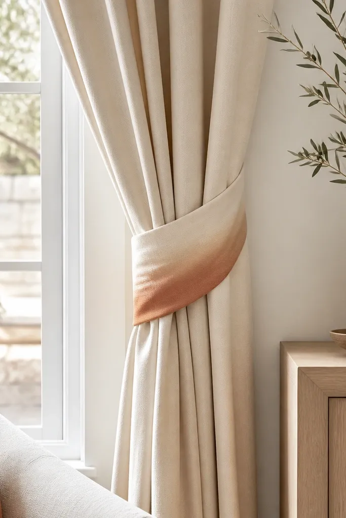
Start with plain cotton tie strips, about 12 inches long and 3-4 inches wide. Mix fabric dye in a bucket and dip the fabric gradually for the ombre effect: dip the bottom 1/3 for a minute, pull out, dip again for deeper color on the lower band. Rinse according to dye instructions, then wash once to set color. Iron the tie-backs flat and attach them to your curtain using hidden stitching or small fabric loops. Gather the curtains so the tie-backs sit at the same height on both sides.
Tie-backs are the little thing that makes curtains look dressed, not just hung. An ombre dye job adds a designer color transition that feels more custom than a plain fabric strap. I like cream-to-terracotta because it warms up beige rooms and works with wood and brass. This flatters rooms where your curtains are the right length but feel boring. It also looks expensive because the color change is subtle and consistent across both sides.
One warningDon’t dye over synthetic blends — the color comes out patchy and cheap-looking.
Quick tipUse a slightly darker dye on the bottom band so it shows clearly in shadows.
17. Oversized Paper Flower Wall in a Single Color Family
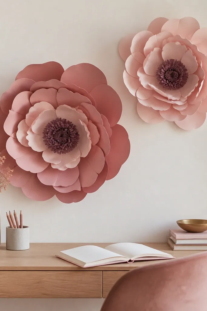
Start by choosing a single color family and making two sizes of flowers, one about 20-24 inches wide and one about 14-16 inches. Use thick craft paper or cardstock and cut petal shapes with a consistent template so the edges match. Layer petals from largest to smallest, gluing at the base so each layer sits slightly offset. Build a center using crumpled paper for texture, then attach the flower to the wall on a foam board backing. Mount the foam board with picture hooks and keep the flowers aligned with your desk centerline.
Big paper flowers look expensive when you keep the color family controlled and the petal edges clean. One or two giant blooms create a focal point that turns a boring wall into something you can’t ignore. I’ve done this for home offices and guest rooms because it feels playful but still “designed.” It flatters people who want personality without buying furniture. Under warm light, the layered petals create depth similar to fabric.
One warningDon’t use too many colors — mixed palettes make paper flowers look like a party decoration.
Quick tipAdd a small matte varnish spray to reduce shine so the petals look like real material.
18. Fake Ceramic Tile Coasters With Faux Grout Paint
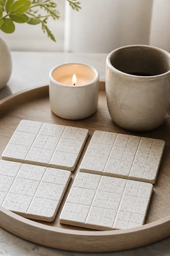
Coasters sound small, but they change how your coffee table looks because they create a repeating pattern. The faux grout lines make them read like real ceramic tile, not painted wood. I use this when the room feels too plain because coasters add texture on a surface you touch daily. It flatters modern spaces by adding a grid pattern, and it flatters cozy spaces by adding warm speckle. Also, they photograph well because the surface has depth, not just flat color.
Start with square tiles or tile-look blanks, like wood squares sealed with primer and sanded smooth. Paint the top with a speckled pattern using a sponge and two paint tones: warm cream base plus a thin layer of gray-brown specks. Let it dry fully, then paint grout lines with a fine brush using a soft gray paint thinned to avoid blobs. Outline the outer edge with the same gray so it looks finished. Seal with a clear topcoat so drinks don’t stain and keep the surface wipeable.
Use painter’s tape to mask the grout lines for crisp edges.
Don’t skip sealing — unsealed coasters stain from coffee fast.
19. DIY Folding Room Divider Panels With Fabric Inserts
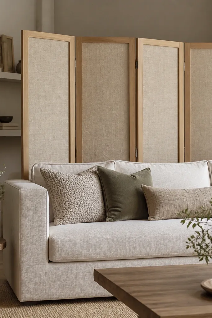
Room dividers look expensive when the fabric is matte and the frame is light wood. The fabric inserts soften the room and hide visual clutter without making the space darker. I use this in open-plan rooms when I need a “zone” for reading or a work area. It flatters rooms with too much furniture by adding a clean break in the layout. The folding design also lets you re-style quickly as seasons change.
Start by buying a folding screen frame or building one from two hinge-connected panels. Cut fabric inserts with a little extra so you can wrap edges tightly and staple on the back. Use linen-look fabric in cream or oatmeal and keep the weave consistent across panels. Attach the fabric so it’s taut, then trim the edges clean. Place the divider behind the sofa or near the desk so it creates a backdrop for a lamp and wall decor cluster.
Iron the fabric before inserting so the panels don’t show wrinkles.
Don’t use shiny satin fabric — it reflects light and makes the divider look cheap.
20. Painted Wood Crate Turned Into a Nightstand With Soft Drawer
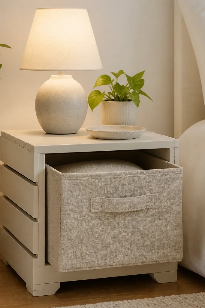
Start by cleaning the crate and sanding edges so it’s paint-friendly. Paint with matte warm white and do two thin coats, sanding lightly between coats for a smooth finish. Add a drawer front by attaching fabric to a shallow frame made from scrap wood, then mount on slides or simple fabric loop supports so it pulls out. Seal the crate interior if you’re using it daily so it wipes clean. Place the nightstand and line up the drawer handle so it sits centered with the bed edge.
A crate nightstand looks expensive when the paint finish is smooth and the drawer front is soft. The fabric drawer keeps the piece from looking like basic storage. I’ve built this for guest rooms where I want “cute but functional” because guests need easy access and a place for chargers. It flatters small bedrooms because the crate shape adds storage without a bulky cabinet look. The styling principle is to keep the top surface airy: one lamp, one small plant, one tray.
One warningDon’t leave the crate raw wood inside if it gets touched often — it looks unfinished fast.
Quick tipUse a fabric drawer in a color that matches your bedding trim so it looks designed, not random.
21. DIY Candle Plate Stand From Scrap Wood and a Brass Plate
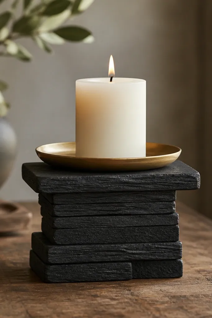
A candle stand changes the entire vibe because it gives height. Even a simple candle looks styled when it’s elevated on a sculptural base. I like using a brass plate because it reflects warm light and looks expensive in photos. This is perfect for shelves, mantels, and coffee tables where you want one hero item without buying a tall decor piece. It flatters rooms with neutral palettes because the brass adds warmth without adding loud color. The styling principle is one hero height piece, then small items around it.
Start by cutting two to three small wood blocks to build a stable pedestal, about 4-6 inches tall depending on where you’ll place it. Paint the base matte black or warm espresso and let it cure. Glue and screw the brass plate to the top block, centering it carefully so it doesn’t wobble. Add non-slip pads under the wood base so it stays put. Place a white pillar candle on the brass plate and style two small items nearby — a book and a ceramic bud vase.
Use a candle with a wider diameter so the flame looks proportionate on the stand.
Don’t use a wobbly base — a slight tilt reads sloppy instantly.
22. Woven Jute Runner Turned Into a Wall Hanging Strip
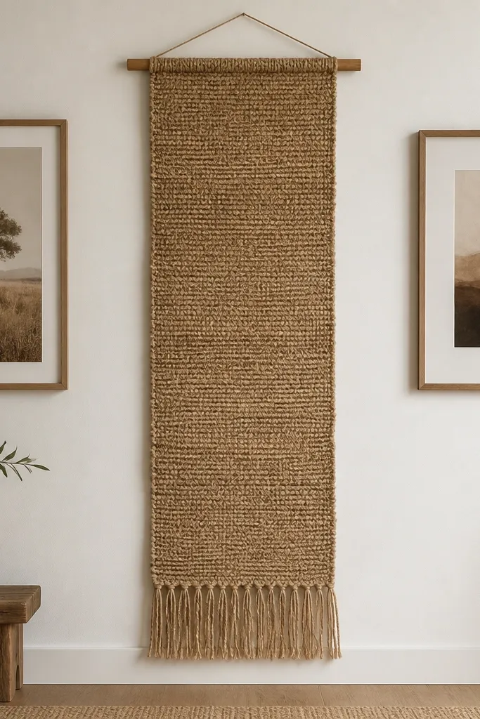
When you hang a woven strip vertically, you add height and texture without adding visual noise. Jute and similar woven materials look expensive when they’re kept long and narrow, not chopped into tiny pieces. I do this between frames or near a mirror because it breaks up flat wall areas. It flatters rooms that need warmth but already have plenty of color — the natural tone blends. The shadow from the weave gives the wall dimension that paint can’t.
Start with a jute runner or placemat that’s long enough to hang down 24-40 inches. Cut the top edge clean if it’s frayed, then thread a wooden dowel through a stitched channel or attach the fabric to the dowel with small staples on the back. Hang the dowel using two wall anchors so it stays level. Position it between two framed artworks or centered above a console so the eye has a clear line. Add one small styling item below, like a ceramic bowl, so the hanging looks like part of a planned cluster.
Steam the weave lightly so it hangs straight instead of curling.
Don’t hang it too close to the ceiling — the vertical effect disappears.
23. DIY Color-Blocked Rug Using Paintable Fabric Backing
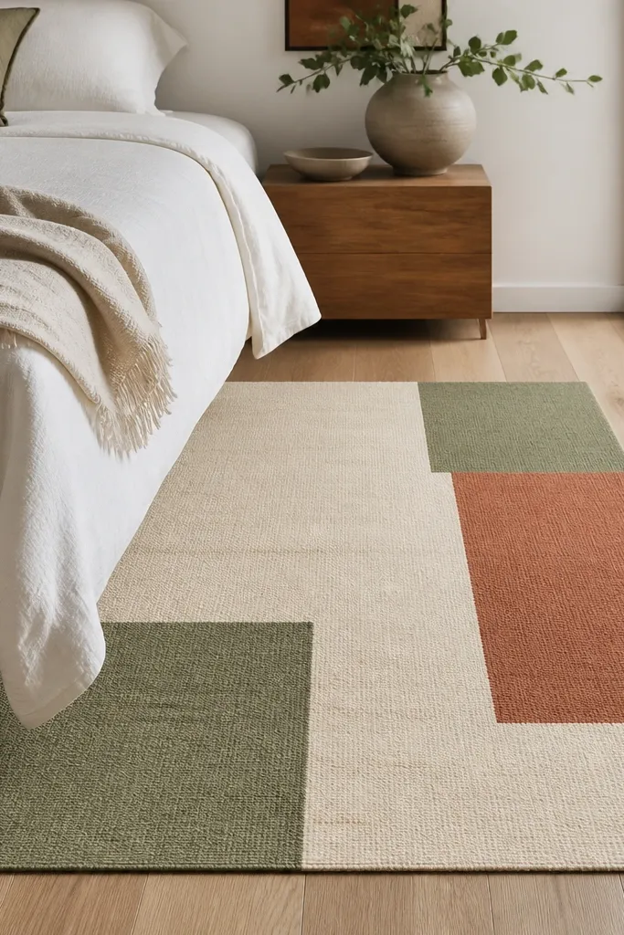
A color-blocked rug makes a room look designed because it adds structure under furniture. DIY works here when you use fabric backing and paint that soaks in, not thick craft paint that cracks. I’ve used this in bedrooms and studios where the existing rug was too plain to anchor the room. The best flattering colors are muted sage and terracotta paired with cream because they warm skin tones and match wood. The styling rule is to keep everything else simple so the rug becomes the pattern.
Start by buying a paintable fabric rug base or thick canvas with a non-slip backing. Tape off color blocks with painter’s tape, pressing edges firmly so lines stay crisp. Paint with fabric paint in two or three muted tones — I use cream base first, then sage and terracotta blocks. Remove tape while paint is still slightly tacky for sharper edges. Let it fully cure, then seal if your fabric paint requires it. Place the rug so the color blocks align with your bed or sofa edges for a clean visual frame.
Do a small test swatch on the same backing material so you know how the color darkens after drying.
Don’t use glossy paint — it looks like a painted sheet, not a rug.