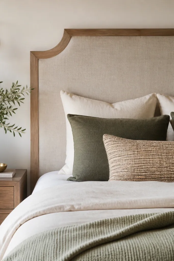
1. Fabric-wrapped foam board panels with a linen-look front
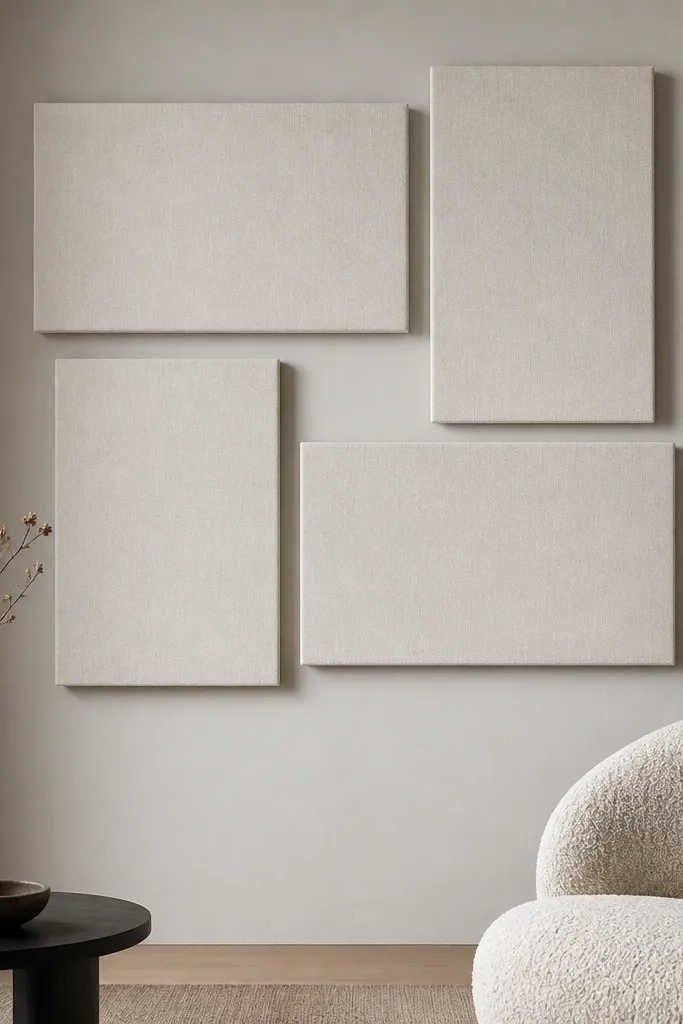
I like this because it adds softness without the bulk of framed art. The foam board keeps it flat and lightweight, and the fabric face kills harsh glare from overhead lights. Pick a cream, oatmeal, or warm taupe fabric with a visible weave so it reads textured from across the room.
Cut foam board to the panel sizes you need (for example 16x20 inches for two, and 12x18 for two). Wrap fabric tightly on the back and staple evenly around the edges, then add small picture-hanging strips so the panels sit 1/8 inch off the wall. Use a consistent spacing between panels by marking a grid with painter’s tape before you stick anything.
Quick tipIf your room has brass lighting, choose fabric with a warm undertone (oatmeal or camel) and keep the hardware in brushed brass or warm gold.
One warningDon’t use shiny fabric — it looks cheap under strong light and shows wrinkles fast.
2. Reclaimed wood slat strip wall with hidden ledge mounts
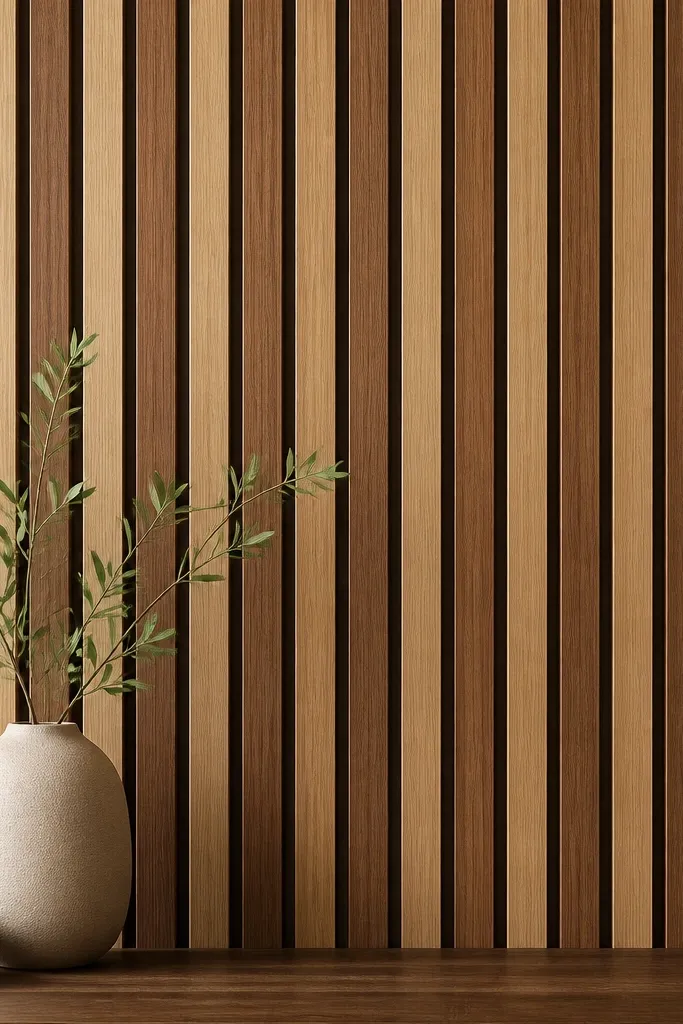
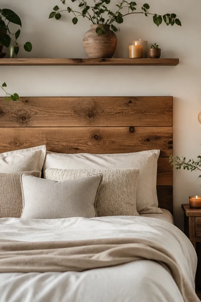
Wood slats give you structure without looking like a craft project. The gaps are what make it modern — you see depth, not just flat boards. I’ve done this with two stain shades so the wall has movement even when the room is otherwise neutral.
Cut 1x2 boards into uniform lengths (start with 24-30 inches depending on your wall). Lightly sand, stain one batch a light tone and the other darker, then seal with matte clear. Mount using a concealed French cleat or individual standoff spacers so each slat has a consistent 1/4 inch shadow gap.
Lay the slats on the floor first and alternate tones in a pattern you like before you drill anything.
Skip random spacing — uneven gaps read sloppy from normal viewing distance.
3. Black line-art "window" set made from printer paper + acrylic frames
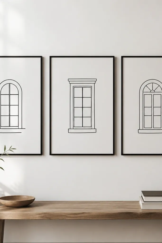
This works because the line weight is consistent and the subject is simple. When you use a white background and black ink, the art stays readable even in low light. I’ve paired it with modern furniture because the clean geometry looks intentional rather than decorative clutter.
Print your line art at the exact frame size (like 11x14 or 12x16). Use acid-free paper if you can, then mount the print with a thin mat so it doesn’t touch the glass. Keep frame spacing tight — 2-3 inches between frames looks like a designed set.
Quick tipUse matte acrylic or anti-glare glass if your wall is across from a window; shiny glass makes the lines look hazy.
One warningDon’t stretch or skew the print when mounting; crooked art is the fastest way to make it look DIY.
4. 3D paper rosettes in a single-color ombre grid
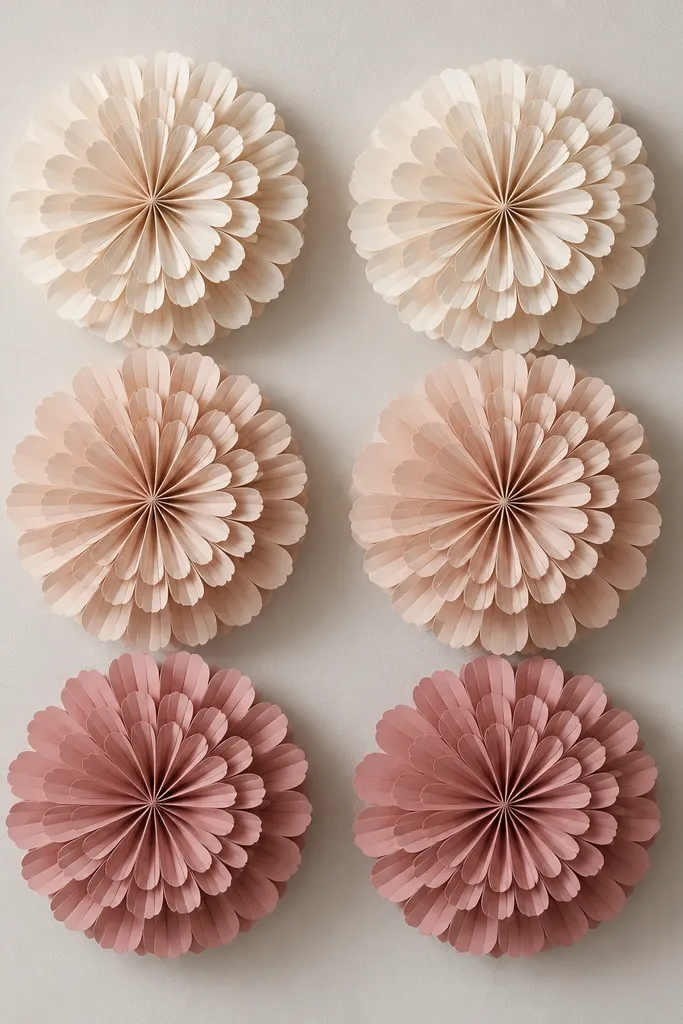
Paper rosettes sound like a party craft until you keep everything one color family and mount them flat. The shadow from layered petals gives depth, and the ombre makes the wall feel curated. This is the easiest DIY that still looks modern when you use a tight grid.
Cut rosette pieces from heavyweight craft paper or cardstock in 5-7 shades of one color (cream to rose). Assemble with a light glue and stack so each rosette is 2-3 inches wide. Mount on foam squares or thin spacers so each rosette sits 1/4 inch off the wall for visible shadow.
Use a ruler and cut guide for consistent rosette diameter; uneven sizes make the grid look random.
Don’t use mixed patterned papers — it reads busy fast in a living room.
5. Tile-look peel-and-stick mosaic with grout-line effect
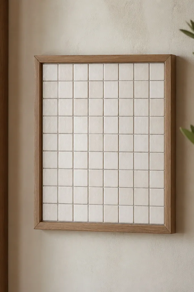
This is a sneaky way to get a high-end look without the mess of real tile. The grout-line effect gives you the grid structure that makes a wall feel finished. I used it over a blank wall behind a console and it immediately grounded the space.
Choose peel-and-stick tiles that already have grout lines printed or embossed. Plan a panel size like 24x36 inches, then add a thin wood frame (1x2 pine ripped down, sanded, and painted). Stick the tile sheet flat first, then seal the frame edges so it looks intentional.
If your wall has texture, press the panel in sections and use a plastic smoothing tool to avoid bubbles.
Skip applying over glossy paint without cleaning — adhesion fails and corners lift.
6. Macramé-style cotton rope wall hanger with a wooden dowel
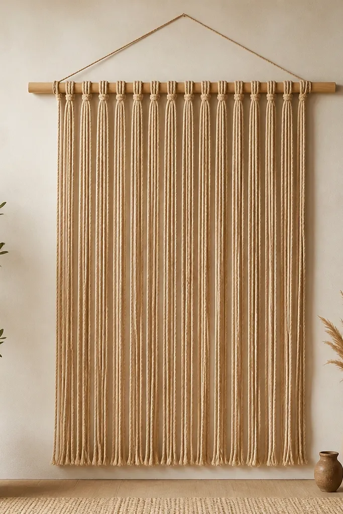
Rope wall hangings add softness and movement without needing bright colors. The trick is keeping it simple: one dowel, one knot line, and uniform strand thickness. In a living room, it looks best above a sofa or in a corner where you can see the rope texture up close.
Use a 1-inch diameter dowel cut to your desired width (around 30-40 inches for a sofa). Select cotton rope strands cut to 24-30 inches for a hanging length that stops above your seat height. Tie strands evenly using the same knot type each time so strand spacing stays consistent.
Quick tipSteam the rope lightly after hanging to remove kinks from shipping; it makes the texture look crisp.
One warningDon’t mix rope thicknesses — it makes the drape uneven and messy.
7. Shadow-box "book page" collage with moth-gray background
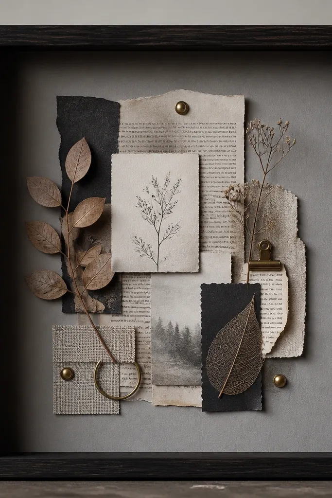
Shadow boxes make paper feel dimensional and grown-up. The moth-gray background keeps the collage from looking scrapbooky. I’ve used this when clients want something personal but not loud — it’s readable up close and calm from across the room.
Use a deep frame (like 2-inch depth) or build one with MDF. Paint the backing gray and seal it matte so paper edges don’t look glossy. Layer torn pages with glue dots, then add a couple of tiny brass brads or a short strip of gold leaf on one side.
Keep the collage to one corner or one diagonal — your eyes need a simple path.
Don’t cram every inch — dense paper turns into visual noise.
8. Painted geometric wall panels with a 1/2-inch ledge border
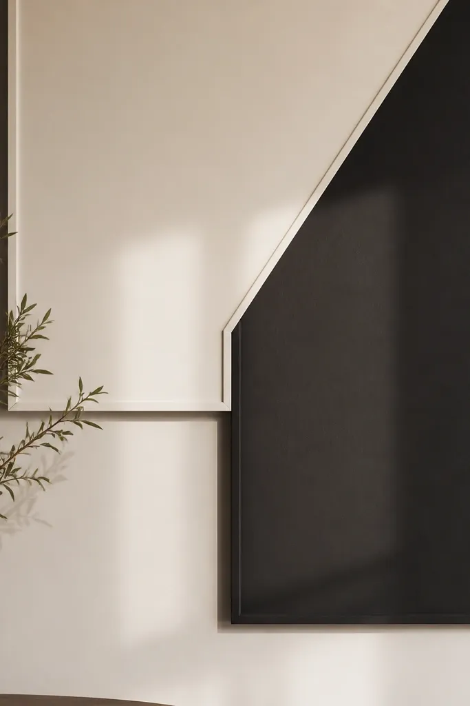
This looks like a designer wall treatment because the shapes are crisp and the edges cast a shadow. The 1/2-inch ledge border makes it read as architecture, not just paint. I do this with two colors so it stays modern and doesn’t fight your furniture patterns.
Cut foam board or thin MDF shapes and attach them to the wall using construction adhesive and small nails into studs when possible. Prime, then paint the base color first, mask the geometric shapes with painter’s tape, and paint the second color. Seal with a matte wall finish so the edges don’t glare.
Quick tipUse a 2-foot level and tape guides for the first straight line; everything else locks in after that.
One warningDon’t use low-tack tape — it lifts paint and creates jagged edges.
9. Oversized fabric bulletin board with framed edges and hidden push pins
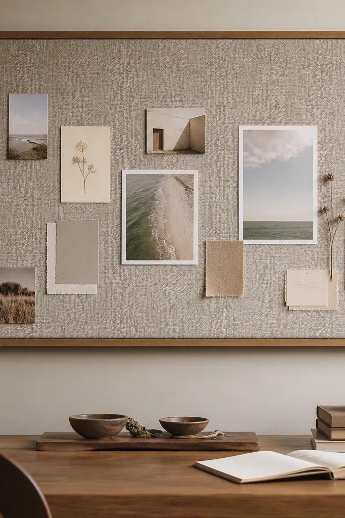
This is a practical decor idea that still looks intentional. The fabric face gives you a soft background, and the frame makes it look like art. I’ve used it in living rooms where people keep swapping prints — the board keeps the wall from turning into a rotating mess.
Cover a thin cork board or foam board with fabric, staple on the back, then mount a wood frame around it. Use flat push pins and choose pins in black or warm brass so they blend. Arrange 5-10 photos or small prints with consistent spacing so it reads like a gallery, not a to-do list.
Quick tipPick fabric with a tight weave so pins don’t look like big holes.
One warningSkip cheap glittery fabric — it catches light and makes pins stand out.
10. DIY faux stained glass using contact film and clear acrylic borders
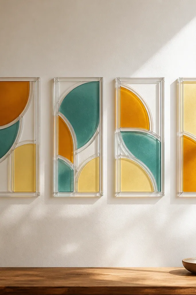
The look is stunning when you keep the palette tight and let the light do the work. Contact film creates the stained-glass color blocks, and acrylic outlines make it look finished. I’ve hung these near a window so daylight makes the colors glow.
Cut translucent contact film into geometric pieces and layer them on a clean flat backing. Use thin clear acrylic strips or acrylic tape to frame each piece like lead lines. Mount the finished panel with picture-hanging hardware rated for the weight of acrylic and backing.
Quick tipUse a lint roller on the backing before applying film — dust traps create ugly white specks.
One warningDon’t overpack colors; three colors plus one neutral looks modern, five colors turns chaotic.
11. Floating shelf frames holding 6x6 ceramic tiles
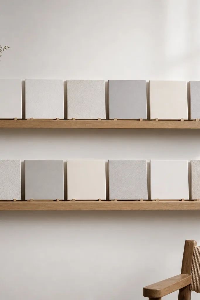
Tiles bring a clean pattern and a hard surface that balances soft furniture. The shelf framing makes them look like intentional wall decor, not random collectibles. I like this when you want texture without big artwork.
Buy 6x6 ceramic tiles in two tones, then seal them with a matte sealer if needed. Build a shallow frame or use a ready floating shelf kit and add tile spacers to keep even gaps. Mount into studs and keep the shelf depth around 3-4 inches so tiles don’t look cramped.
Quick tipWipe tiles with rubbing alcohol before installation; it helps adhesives and spacers grip.
One warningSkip mounting without stud locations — shelves wobble and tiles shift over time.
12. Hand-painted ceramic plate wall cluster in a 12-inch circle
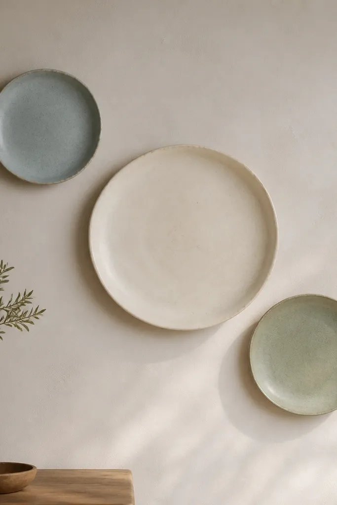
Plates look expensive when the colors are calm and the spacing is deliberate. You get a “gallery plate” vibe without buying a whole set of matching décor. The matte glaze on each plate avoids glare and makes the colors feel softer.
Use plate hangers or small wire plate hooks behind each plate. Paint plates with ceramic-safe paint and let them cure per the paint instructions. Arrange them so the largest plate is centered and the smaller ones sit 4-6 inches away, forming a gentle arc.
Test the arrangement on the floor first using masking tape circles to nail the spacing.
Don’t mix glossy and matte finishes; the glare mismatch makes it look off.
13. Large-scale DIY stenciled mural band behind the sofa
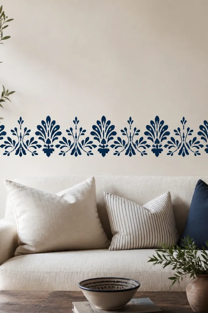
A mural band instantly fills a long wall without needing a giant frame. Stencils keep the repeat pattern straight, and navy on warm white reads modern. I’ve used this to break up plain walls that feel too blank but can’t handle full wallpaper.
Pick a stencil with a simple repeat and measure your sofa width. Mark a straight baseline with a level, then tape the stencil down and use a small foam roller for even paint coverage. Keep the band height around 10-14 inches so it looks intentional and not like a border sticker.
Quick tipWipe the stencil edges between pulls; dried paint causes fuzzy lines.
One warningAvoid brushing paint on — it bleeds under stencil edges and looks messy.
14. DIY corkboard framed in wood with a fabric pin cover strip
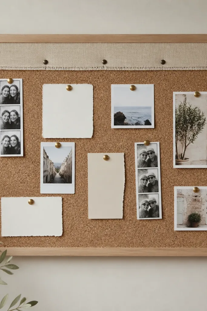
If you like changing photos or seasonal notes, this is the decor that keeps working. The cork texture is visually warm, and the fabric strip adds a softer accent. It looks designed because the frame matches your other wood tones.
Cut cork sheet to size, then frame with 1x2 wood cut to your dimensions. Add a fabric strip on the top edge only, stapled to the back, so the board still functions. Use small card clips or thumbtacks in one finish to keep it consistent.
Pre-plan your card layout: two rows max so it doesn’t turn into a clutter wall.
Skip random pin colors; mixed metals look messy fast.
15. Mirror + wood slat combo for instant depth
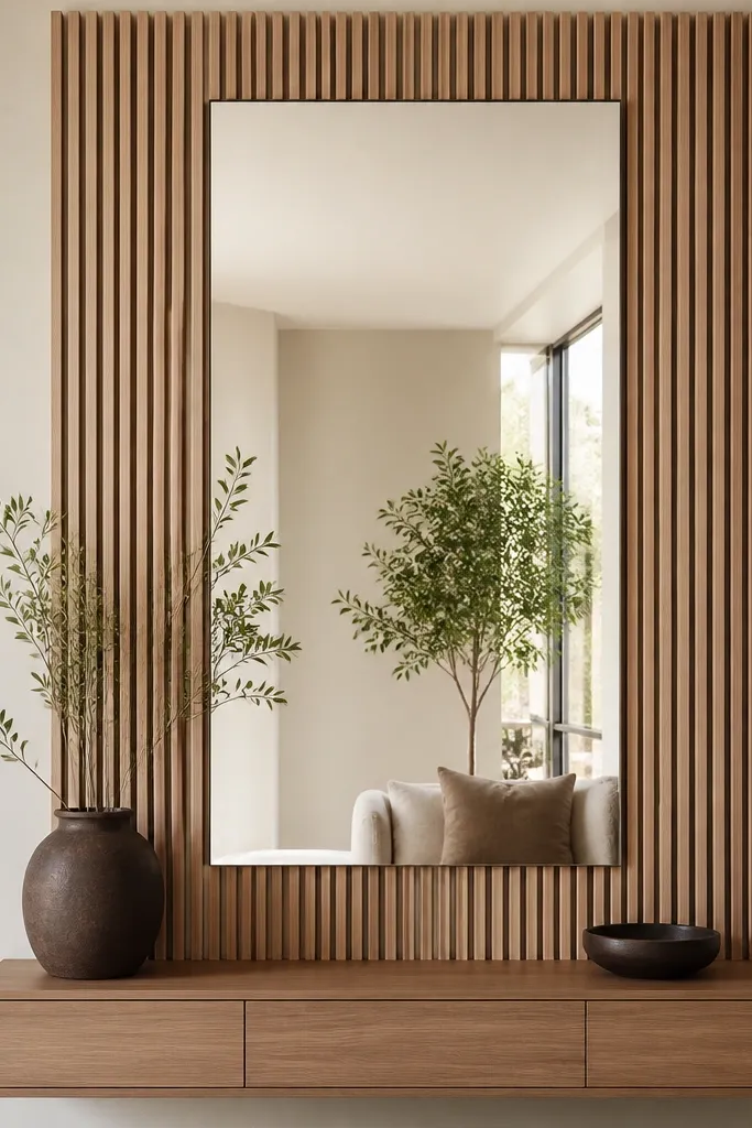
This makes a wall feel bigger because the mirror does real light work. The slats give it texture so it doesn’t look like a basic mirror from a big-box store. I’ve used it in smaller living rooms where you need brightness without more furniture.
Choose a mirror size around 24x36 inches or 30x40 depending on your wall. Build a slat frame around it using thin strips (about 3/4 inch wide) with a consistent 1/2 inch gap. Mount the mirror securely first, then attach slats to a backing board so everything stays aligned.
Use a matte wood finish if your mirror already has a shiny frame; it keeps the look calm.
Don’t mount the mirror crooked — slats exaggerate misalignment.
16. Vintage map prints in mismatched frames with one shared color mat
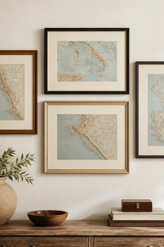
Mismatched frames can look collected instead of chaotic when you unify one element. The shared mat color is the glue that makes the set feel intentional. I like using antique map prints because they add pattern without bright colors.
Print maps or use vintage-style map paper sized to fit the frames you find. Use the same matboard color for every frame — cream or light gray — and keep the mat opening consistent. Hang the gallery in a rectangle layout so the top and bottom edges line up.
Keep the frames to two finishes max (like black + natural wood) so it doesn’t drift into random.
Skip bright frame colors like red or orange; they fight the map tones.
17. Metal picture ledge with floating faux plants and a single art print
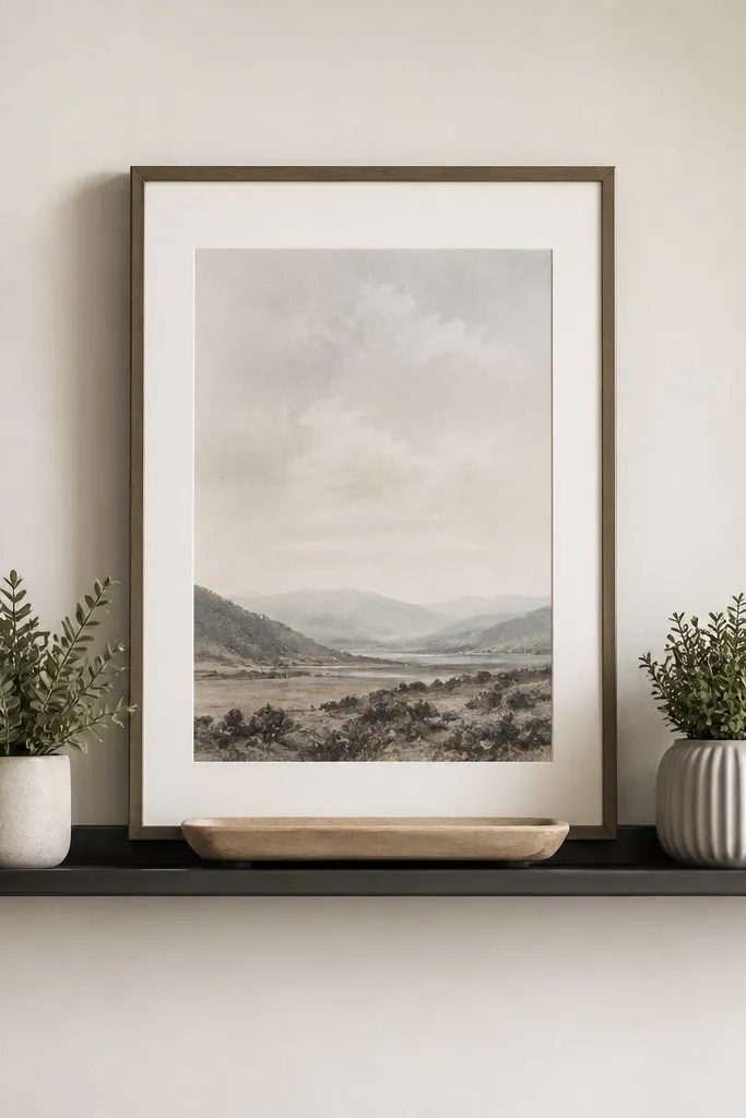
This setup looks curated because you only have one “main” print and the rest is supporting styling. The ledge gives you height and keeps decor at eye level. I’ve used it to make a blank wall feel lived-in without stacking five separate pieces.
Pick a metal ledge about 16-24 inches wide and mount into studs. Use small plant pots in the same color family (black, terracotta, or matte white). Place the framed print centered, then add plants symmetrically with a small spacing so the frame doesn’t get blocked.
Choose plants with the same leaf size even if the colors differ; it looks more balanced.
Don’t cram too many items on the ledge; gaps make it look intentional.
18. DIY fabric bunting framed like art with a dowel backing
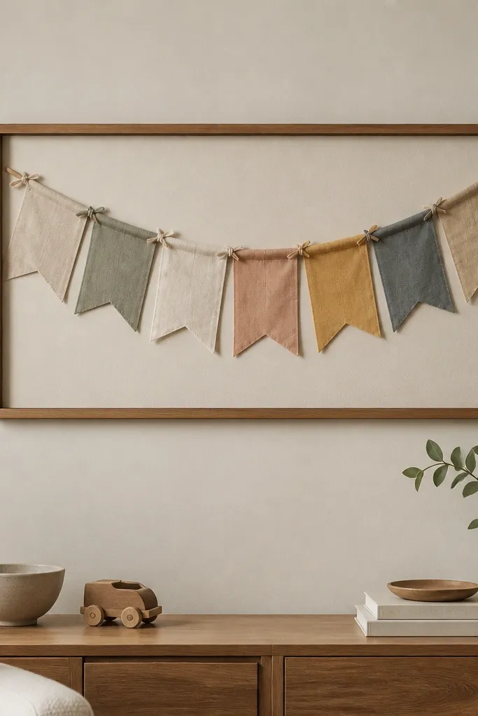
Bunting in a frame looks like decor, not party supplies. The fabric gives texture, and the frame keeps the layout tight. I like using small pennants in two shades so it feels calm and modern.
Build a shallow frame with a backing board and mount a dowel across the top inside. Cut fabric pennants about 5-6 inches wide and 7-9 inches long, then tie them evenly to the dowel. Attach a hanging hook to the back so the frame sits flat and centered.
Quick tipUse cotton or linen-like fabric; it holds shape better than thin polyester.
One warningSkip flimsy fabric — it collapses and looks wrinkled.
19. DIY oversized cork letters with black vinyl stencils
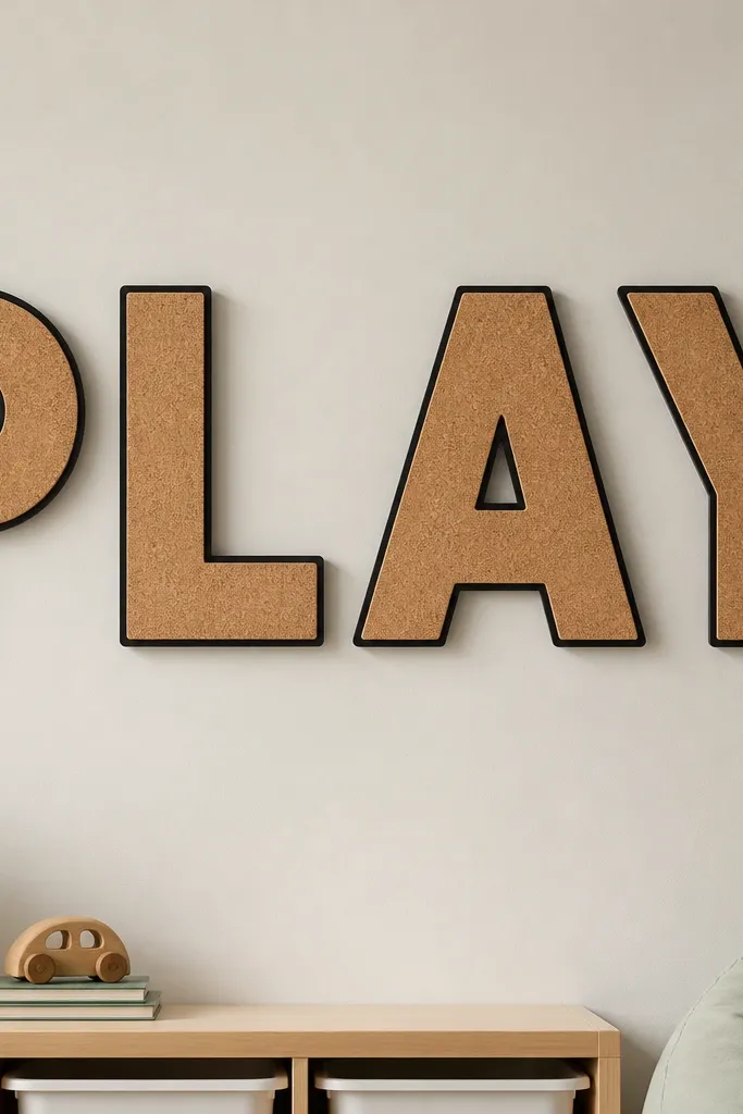
This is how you make typography feel handmade without turning it into a classroom craft. Cork has a natural texture that looks good under soft light. The vinyl outline keeps the edges sharp so it doesn’t look fuzzy or cut-out.
Cut letters from cork sheet using a sharp craft blade and a printed stencil. Apply black vinyl as an outline or fill, then seal the vinyl edges with a light matte clear spray. Mount letters on standoffs or directly with strong adhesive, and keep consistent letter spacing.
Quick tipScale the letters so the tallest one is about the same height as your wall’s light fixture center — it anchors the room.
One warningDon’t use thick vinyl without a burnishing tool; edges lift and look sloppy.